


General Motors.


Loading...
0%


Fleet managers needed a simpler way to access and manage the growing number of GM fleet services, vehicles, orders, and connected experiences in one place.
The experience needed to bring multiple fleet capabilities together while making complex information and workflows easy to navigate, understand, and act on.
01 - Understand
User needs
Research
Business requirements
02 - Define
User journeys
Information architecture
Product strategy
03 - Structure
Navigation
User flows
Wireframes
Interaction
04 - Design
UI
Visual language
Responsive experiences
05 - Systemize
Design system
Components
Design tokens
06 - Validate
Usability testing
Visual evaluation
Iteration
07 - Deliver
Prototype
Developer collaboration
Handoff
Our vision is to create an application that unlocks advantages for both our valued fleet customers and GM. We aim to provide an exceptional one-stop solution, empowering customers to manage their fleets effortlessly, fortifying the GM-customer relationship based on trust and mutual growth.


First, I identified the users.

After identifying the users, I constructed the user journey and the user flow to help shape the product and its features.


01 - Account Creation: Establishing the entry point
How might we create a simple, intuitive entry point for fleet managers joining GM Envolve for the first time?
Because GM Envolve was a new experience, there was no existing account-creation flow to optimize. I focused on establishing a straightforward entry point that guided fleet managers through the required steps while setting the foundation for their experience within the platform.
My flow: Create Account > Enter Information > Verify > Complete Setup > Enter Fleet Experience
02 - Onboarding
How might we help fleet managers quickly understand the platform and get set up for success?
With GM Envolve being a new experience, onboarding needed to introduce the platform's capabilities while guiding fleet managers through the information and steps needed to get started. I designed the experience to progressively introduce key features, establish context, and provide a clear path into the fleet-management experience.
My flow: Welcome > Introduction > Setup > Platform Overview > Fleet Hub
03 - Fleet Hub
How might we create a central hub that gives fleet managers a clear view of their fleet and the tools they need to manage it?
The Fleet Hub served as the primary destination after onboarding, bringing key fleet information, services, and actions into one centralized experience. I focused on establishing a clear information hierarchy that allowed fleet managers to quickly understand the state of their fleet and access the capabilities most relevant to their day-to-day work.
My flow: Fleet Overview > Key Information > Available Actions > Fleet Services
04 - Fleet Management
How might we give fleet managers a simple way to manage and understand their vehicles at scale?
With the core fleet experience being designed from the ground up, the challenge was to organize complex vehicle information and fleet-management capabilities into an experience that felt clear and intuitive. I focused on creating a scalable structure that allowed fleet managers to quickly access their vehicles, understand key information, and take action without unnecessary complexity.
My flow: Fleet Overview > Vehicle Information > Vehicle Actions > Fleet Services
05 - Offers
How might we connect fleet managers with relevant GM products and services at the right moment?
The Offers experience was designed to give fleet managers a clear way to discover products, services, and opportunities relevant to their fleet. I focused on creating a structured experience that made offers easy to discover, understand, and act on without disrupting the core fleet-management workflow.
06 - Order Tracking
How might we give fleet managers a clear view of their orders from purchase to delivery?
Order tracking needed to make a potentially complex process easy to understand at a glance. I designed the experience around clear status communication, key order details, and a straightforward progression from order placement through fulfillment, giving fleet managers confidence in where their orders stood and what to expect next.
Research insights
Through user research, I learned that fleet managers needed a more unified way to access the tools, information, and services associated with managing their fleet. The experience needed to balance a large amount of information and functionality while keeping the most important actions easy to find and understand.
One connected experience
Information needs to be prioritized
Make complex workflows feel simple
Based on the insights gathered from user research, I mapped out the flow below. This helped shape the features and the MVP.

Defining the MVP
After collaborating with designers and managers, I helped define the MVP and establish a roadmap for future feature enhancements. The goal was to create a strong foundation for the initial launch while ensuring the product could scale as additional fleet capabilities were introduced.

I mapped the account-creation journey to understand the different paths a user could take and the decisions the experience needed to support. The goal was to make account creation feel straightforward while accounting for different entry points, required information, verification, and potential errors. Mapping the flow helped me identify where users could encounter friction and establish a clear path between each step before designing the final interface.
My flow: Create Account > Enter Information > Verify > Complete Setup > Enter Fleet Experience
New Account Creation & Verification
I started with the core account-creation journey, mapping the experience from initial sign-up through verification. I also considered invited users as a separate entry point, since they arrive with a different context but ultimately need to reach the same account-activation experience.


Business Account Creation
Business accounts introduced additional information and decision points, so I extended the flow to account for the longer form experience. Rather than treating validation and errors as edge cases, I mapped them as part of the primary experience so the UI could provide a clear response at each point of friction.


After submission, a business account may require additional review before the user can proceed. I designed the pending state as part of the account-creation journey, giving users clear feedback about what is happening and providing a path to support when they need assistance.

Once the account was created, the next challenge was helping first-time business users understand where they were and what they could do next. Because business accounts may require review before becoming fully active, I designed the onboarding experience around that transitional state. Rather than leaving users at a dead end after registration, the experience introduces them to myBA, communicates their account status, and gives them useful actions while they wait.
My flow: Welcome > Introduction > Setup > Platform Overview > Fleet Hub
Supporting the first-time experience
I explored the onboarding journey through two primary paths. The first guides users directly into myBA, where they can begin familiarizing themselves with the product and its navigation. The second provides a more support-oriented path for users who need additional information while their account is pending.This allowed the onboarding experience to remain useful regardless of whether the user's account was immediately ready or still required review.


The design rationale
Give users immediate context: A pending account can create uncertainty, so the onboarding experience clearly communicates the user's current status and what that means.
Keep users engaged: Instead of treating the pending state as a stopping point, I introduced the myBA experience and surfaced relevant areas users could begin exploring.
Provide a path to help: For users who needed additional assistance, I incorporated direct access to support and FAQs so they weren't forced to leave the product to find answers.
Introduce the product gradually: I also used the first-time experience to establish the product's navigation and key interactions without overwhelming the user with information upfront.
With the account-creation and onboarding flows defined, I had a clear picture of the first-time user's journey—from registration and review through their first interaction with myBA. This gave me the foundation to design the individual screens and determine how information, navigation, and actions should be presented within the product.
Once users completed onboarding, the next challenge was helping them understand the Fleet Hub and quickly find value in the dashboard. I designed the Hub to support users at different stages of their journey—from a first-time user with no fleet data to an active user managing a populated fleet. The experience needed to communicate what was available, make complex fleet information easy to scan, and provide guidance without competing with the data itself.
My flow: Fleet Overview > Key Information > Available Actions > Fleet Services
The Hub was designed to give users an immediate view of their fleet without requiring them to navigate across multiple areas of the product. Through user research and iterative design, I identified the information users needed to quickly understand the overall status of their fleet. Rather than treating each metric as an isolated data point, I organized the Hub around four complementary categories. Together, these categories create a layered view of the fleet:
Availability: What do I have available?
Vehicle availability establishes the current capacity of the fleet. It gives users an immediate answer to how many vehicles are available and ready for use.
Status: What state is my fleet in?
Availability doesn't tell the whole story, so I paired it with a breakdown of vehicle status. This provides context around where the rest of the fleet sits and helps users quickly identify potential issues or changes in fleet health.
Activity: What is happening over time?
I introduced activity data to give users a view of fleet behavior over time. This moves beyond a snapshot and helps users recognize trends and changes in how their fleet is being utilized.
Orders & Connections: What operational activity needs attention?
Finally, I surfaced orders and vehicle connections to provide visibility into the activity surrounding the fleet. These help users understand what is currently happening operationally and where they may need to take action.

Together, these categories create a complete view of fleet operations:
Availability: tells users what they have.
Status: tells them the condition of what they have.
Activity: tells them how the fleet is behaving over time.
Operational activity: tells them what is happening and where attention may be needed.
This hierarchy became the foundation for the Hub, allowing users to move from a high-level understanding of their fleet to the specific information needed to make decisions.

Through multiple iterations and user testing, I refined the information users needed to effectively manage their fleet. The categories that remained were the ones that consistently helped users understand the state of their vehicles and determine what required their attention. This resulted in a focused set of data categories that together provide a complete picture of the fleet from availability and status to connectivity, maintenance, and actions.
My flow: Fleet Overview > Vehicle Information > Vehicle Actions > Fleet Services
Categories:
Availability → Is the vehicle available?
Fleet Group → Where does it belong?
Connectivity → Is it connected and reporting?
Oil Life → Does it need maintenance attention?
Field Actions → Does something need to happen?
Vehicle Details → Which vehicle am I looking at?

My initial version focused on giving users a comprehensive view of their fleet, but I wanted to validate whether the information hierarchy actually supported how they worked.
Usability Test Findings
I put the table through user testing to understand which information users relied on most when scanning and managing vehicles. The feedback showed that some of the information was competing for attention, while the most actionable details weren't prominent enough. Based on those findings, I refined the hierarchy, simplified the presentation, and gave greater emphasis to the information users needed to identify a vehicle's status and determine what required attention. The final version reflects those iterations using the table not just to display more information, but to make the most important information easier to find and act on.
Priority Revisions

One of the biggest changes was prioritizing information based on user behavior rather than simply giving every data point equal visual weight. I used the testing to determine what users needed to see first, what could be secondary, and what could be accessed when needed.

Vehicle info

Rather than overwhelming users with every available data point, I used iteration and testing to prioritize the information that supported the most important fleet-management decisions. The result was a table that allows users to quickly scan fleet health, identify exceptions, and take action.

As part of the fleet-management experience, users also needed a way to discover programs and incentives that could help reduce the cost of operating their fleet. The challenge was making a broad range of programs easy to scan and compare without overwhelming users with information. I introduced a Featured section to give priority to programs that were most relevant or valuable to the user. Rather than asking users to evaluate every available offer, the experience provides a clear starting point and a direct path to learn more.

Below the featured content, I organized the remaining programs into a consistent card-based structure. Each card uses the same hierarchy—visual, program name, description, and Learn More—so users can quickly scan the available options and decide which programs are worth exploring. The card structure also creates a scalable framework for adding or changing programs without changing the underlying experience. Each program can communicate its value independently while maintaining a consistent visual and interaction pattern across the page.
I also separated Fleet Programs from the Competitive Assistance Program at the top of the page, giving users a clear distinction between different types of purchase opportunities before they begin browsing the individual programs.

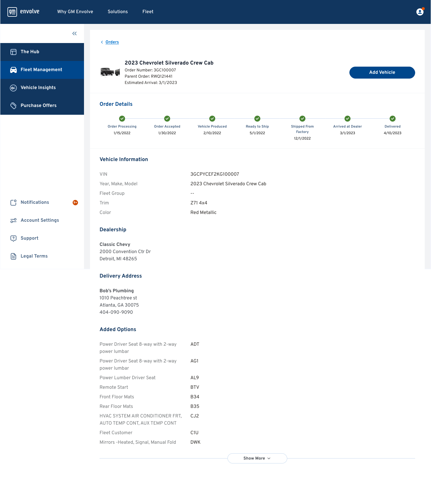
One of the key challenges with vehicle orders was giving fleet customers a clear understanding of where their vehicle was in the ordering and delivery process. Rather than treating order tracking as a simple status label, I structured the page around the questions a customer is most likely to have:
Where is my order?
What has happened so far?
What happens next?
And what exactly did I order?
I made the Order Details timeline the focal point of the page. The horizontal progression gives users an immediate view of the entire journey. Below the timeline, I organized the supporting information into progressively more detailed sections. Vehicle information, dealership, delivery address, and added options are separated into clear groups so users can scan for the information relevant to them rather than navigating through one long block of order data.
We launched an initial beta to put the product in users’ hands, gather feedback, and identify opportunities to refine and improve the experience. Following the beta launch, the initial response to the product was positive, but usage revealed an important gap. Users understood the value of having fleet information centralized in one place, but engagement dropped as they moved beyond the initial exploration of the product.
GM Envolve My Account Beta by the Numbers

Predominantly driven by Solution Summit.

65% of Accounts added vehicles.

Orders on profile enabling future status check.

Positive experience for the users.

Strong contingent that is exploring and continuing to engage without prompting.

Promising indicator for customer acquisition.
Highlights
Positive experience: 90% visual design / 81% onboarding / 87% order tracking
Strong initial adoption: 43 accounts / 2,846 VINs / 577 orders
But a product-value gap emerged: 63% returned / existing tools already handled many fleet-management tasks
User insight

Don't just show me my fleet. Help me manage it better.
This highlighted an important gap: the product was effective at bringing fleet information together, but it wasn't yet providing enough unique value to become part of users' everyday workflow.
The beta helped me recognize that simply centralizing fleet data wasn't enough. Users needed the platform to help them interpret that information and streamline the decisions they were already making.
This led me to explore how the product could move from a passive source of fleet information to a more proactive tool, one that could analyze a user's data, identify opportunities, and recommend actions that could improve operational efficiency and reduce costs.
→ AI analyzes fleet data → calculates costs → identifies inefficiencies → recommends actions such as reducing idling, optimizing routing, etc.
The beta gave me a clear opportunity to evolve the product beyond simply presenting fleet information. I proposed an AI-powered experience that could analyze fleet data, identify inefficiencies, calculate potential costs, and recommend actions to help users reduce operating expenses.
To get leadership buy in, I needed to demonstrate that the concept addressed a validated user need while also presenting a compelling business case. I used the beta results, user feedback, engagement data, and identified gaps in the existing experience to build the case for investing in the next phase of the product.
Building the Case
User Need: I connected the proposal directly to what we learned from beta users: the platform successfully centralized fleet information, but users still had to interpret that information and manually determine how to improve their operations.
Engagement & Product Opportunity: The beta data showed strong initial interest and adoption, but sustained engagement presented an opportunity to deliver more ongoing value. This became the basis for exploring capabilities that could make the product useful as part of users' everyday workflow.
Business Value: I positioned the AI experience around measurable operational outcomes not AI for its own sake. By identifying opportunities around idling, routing, fuel usage, and other fleet behaviors, the product could help users understand where costs were coming from and where savings could potentially be achieved.
Product Differentiation: This also created an opportunity to differentiate myBA from existing fleet management tools. Instead of competing solely on the ability to display fleet data, the product could provide an intelligent layer that interprets that data and recommends what users should do next.
To secure approval, I translated the concept into a product proposal that connected the user problem to measurable business value. I presented the supporting beta data, user feedback, opportunity areas, proposed AI capabilities, and the potential impact on user engagement and operational efficiency.
The opportunity was to move beyond simply presenting fleet data and help users understand what that data meant for their business. I proposed an AI-powered experience that could analyze fleet activity, identify inefficiencies, calculate their financial impact, and recommend specific actions to reduce operating costs.
I designed the experience around a simple progression: identify the issue → quantify the impact → explain the opportunity → recommend an action.
Turning Fleet Data Into Action
Identify the Opportunity: The AI first analyzes fleet behavior to identify areas where the user may be losing money or operating inefficiently. In this example, excessive idling is surfaced as an opportunity because it represents a behavior that can directly contribute to unnecessary fuel consumption and operating costs. Rather than requiring users to discover this pattern themselves, I wanted the system to proactively bring the opportunity to their attention.
Quantify the Impact: Once an opportunity is identified, the experience translates the underlying fleet data into a financial impact. Showing the estimated cost makes the insight immediately understandable and gives users a reason to care about the recommendation.
Explain the Why: I wanted the AI recommendations to feel actionable rather than like a black box. The experience therefore provides context around what is driving the recommendation, allowing users to understand the behavior behind the projected savings.
Recommend What to Do Next: The final step is turning the insight into an action. Instead of stopping at “you are spending too much,” the AI suggests practices that could help reduce the cost—for example, reducing unnecessary idling or improving routing. This creates a direct connection between the user's fleet data and a potential operational improvement.


The larger design principle
The core design principle was to reduce the amount of work users had to do themselves. The existing product gave users access to fleet data, but they were still responsible for finding patterns, calculating costs, and determining what actions to take. The AI experience was designed to take on that analytical work and present the result in a way that users could quickly understand and act on.
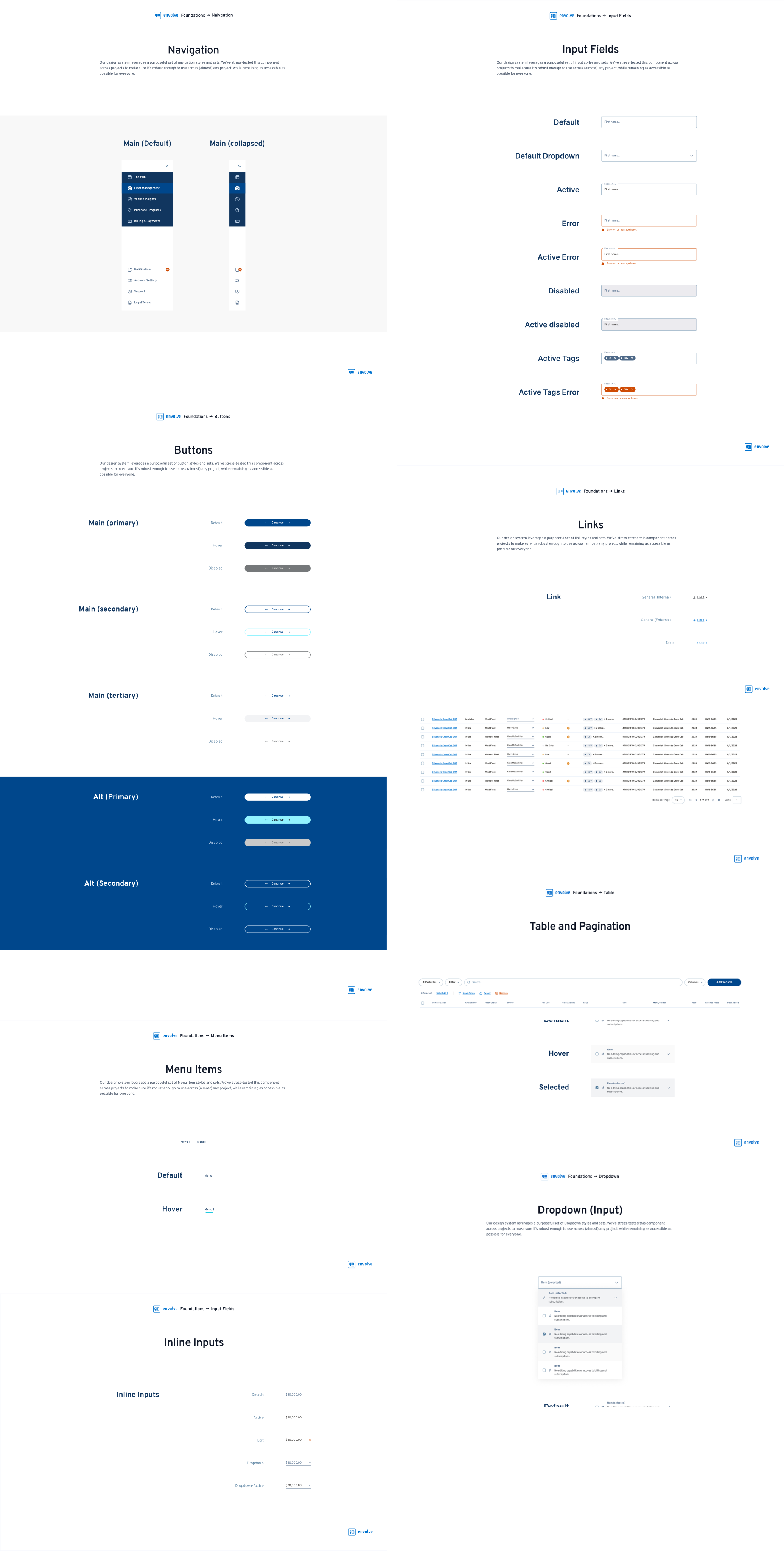
As the product expanded across multiple experiences, I needed a consistent foundation that could support new features while maintaining a cohesive experience. I established a design system that defined the visual language, reusable components, interaction patterns, and accessibility standards used throughout the product.


Rather than treating the design system as a library of UI components, I used it to establish a shared set of standards for how the product should look, behave, and scale.
Setting the Standard: I defined foundational standards for typography, color, spacing, layout, component behavior, and responsive design. These standards created a common visual language and gave designers and developers a consistent reference point when building new experiences.
Accessibility as a Foundation: Accessibility was built into the system from the beginning rather than treated as a final-stage check. I used WCAG guidelines to establish standards around color contrast, typography, interactive states, focus behavior, and component accessibility.
Building for Scale: I structured the system around reusable components and patterns so new features could be designed without reinventing the interface each time. Components were documented with their intended behavior, variations, and usage guidelines, creating a clearer handoff between design and development.
The bigger design decision: The goal was to create a system that could scale with the product without sacrificing consistency or usability. By establishing these standards early, every new feature including the AI experience could build on the same foundation rather than introducing a new visual or interaction language.
This project taught me that good product design is really about listening, testing, and being willing to change direction. It was a lot of fun. I would like to thank my team for helping me through this journey and I hope to work on projects like this again :)
2023 | RUWORKS, All rights reserved
