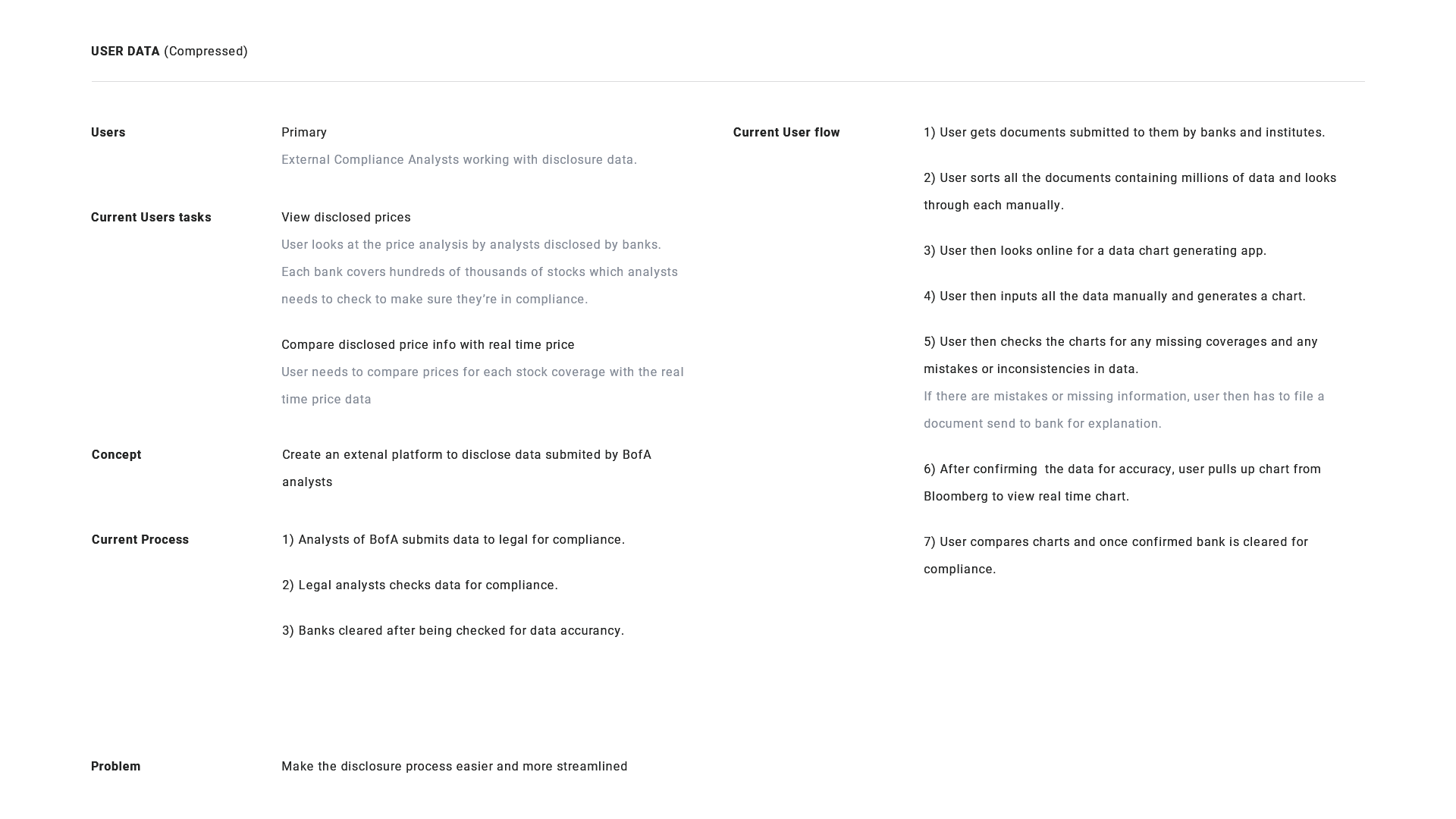
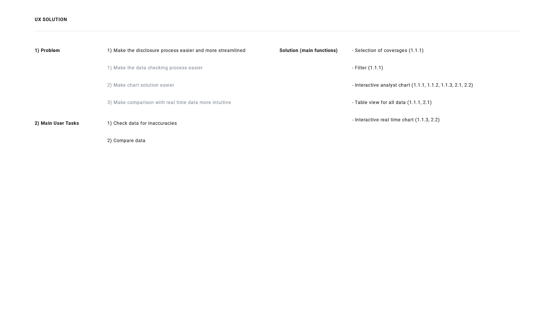
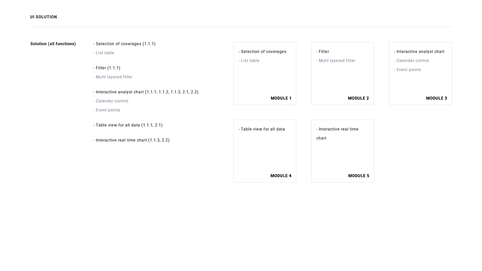
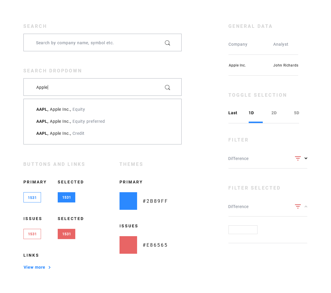
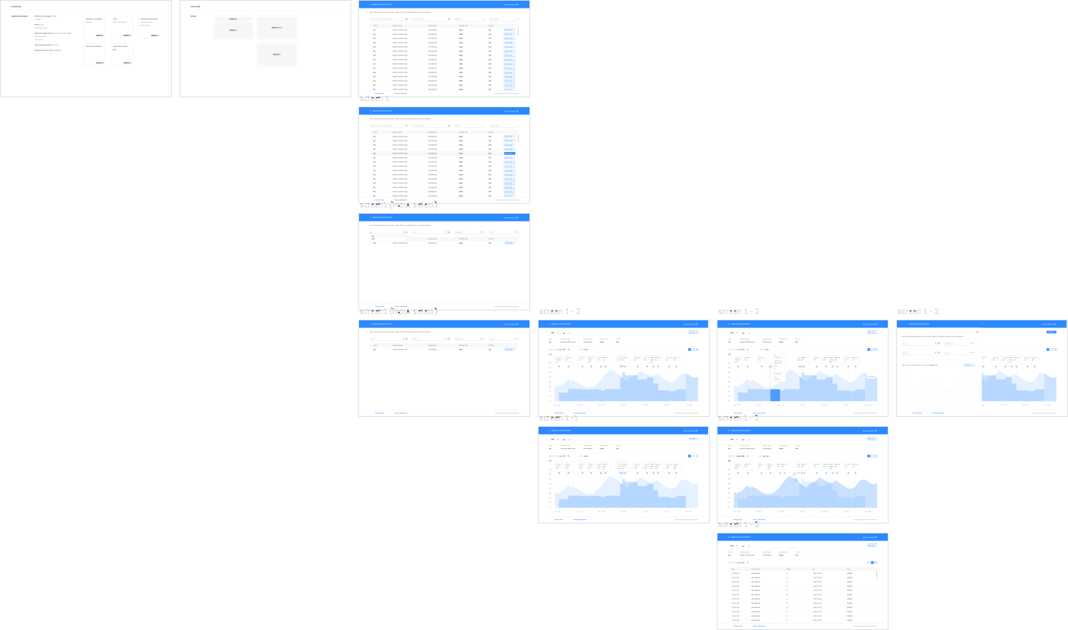
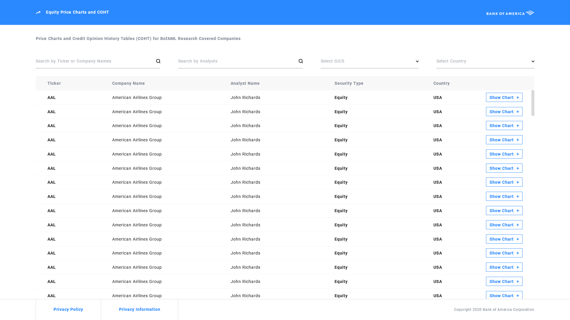
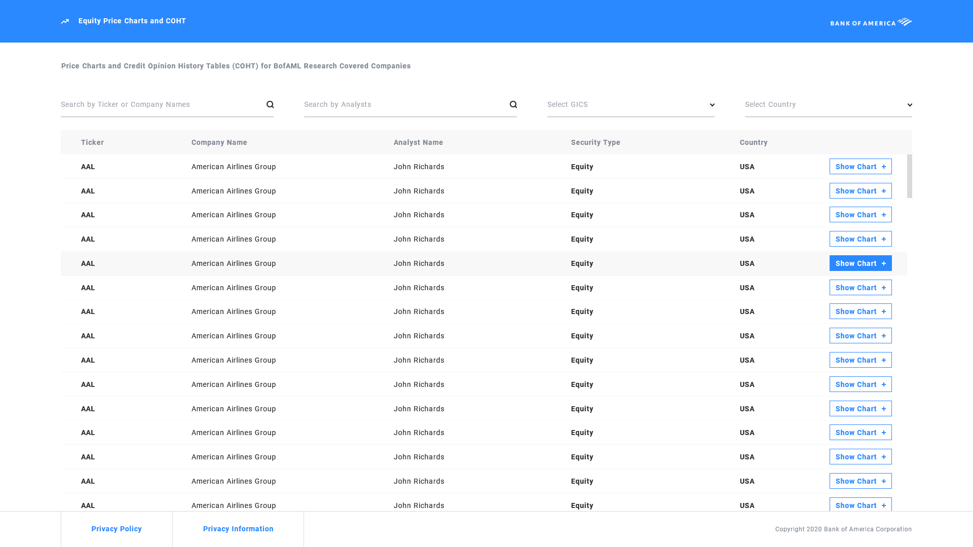
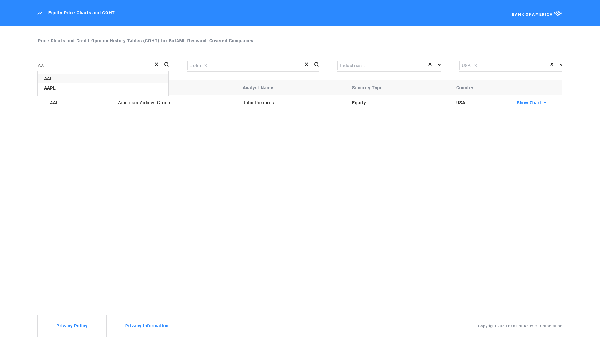
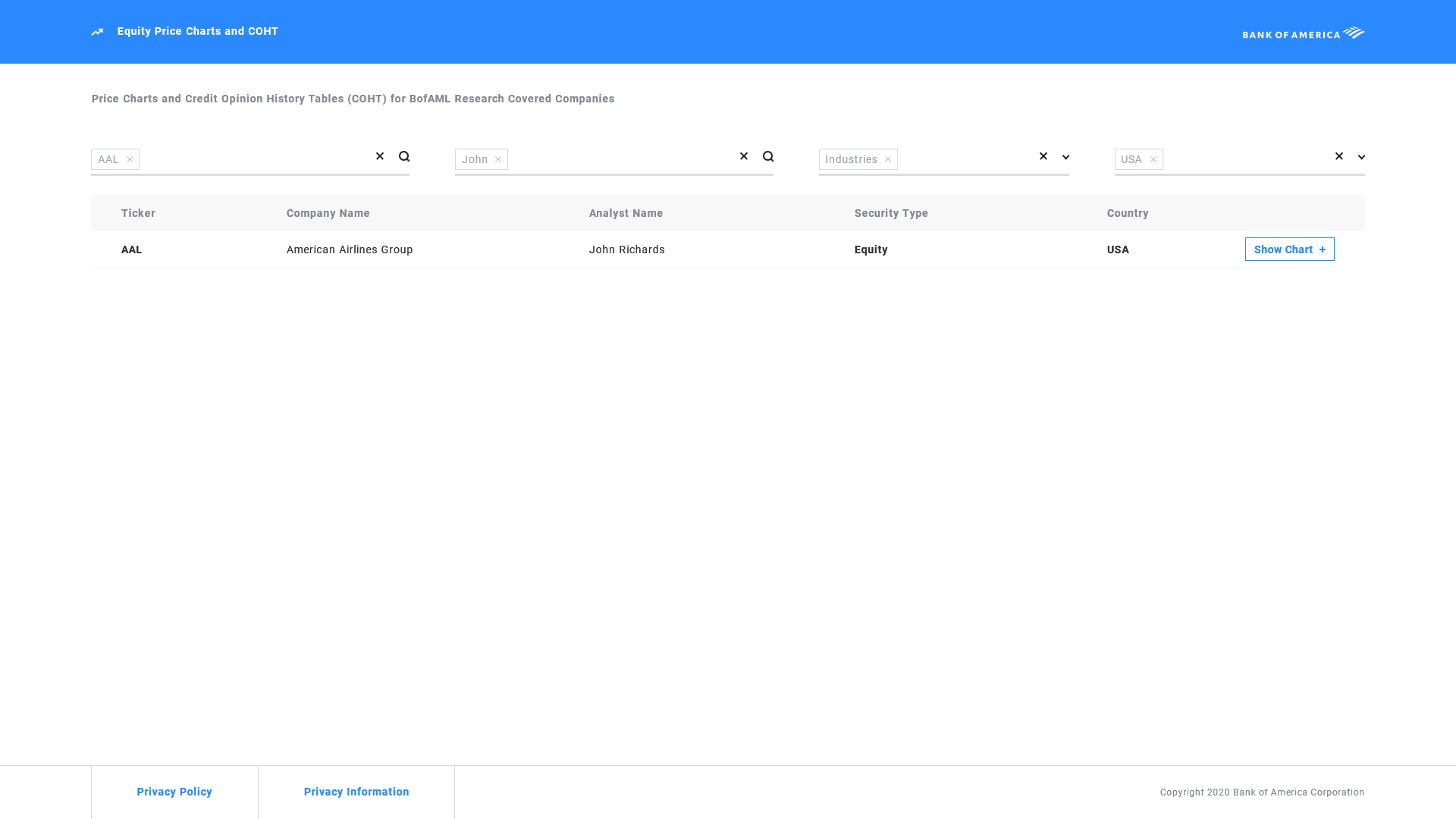
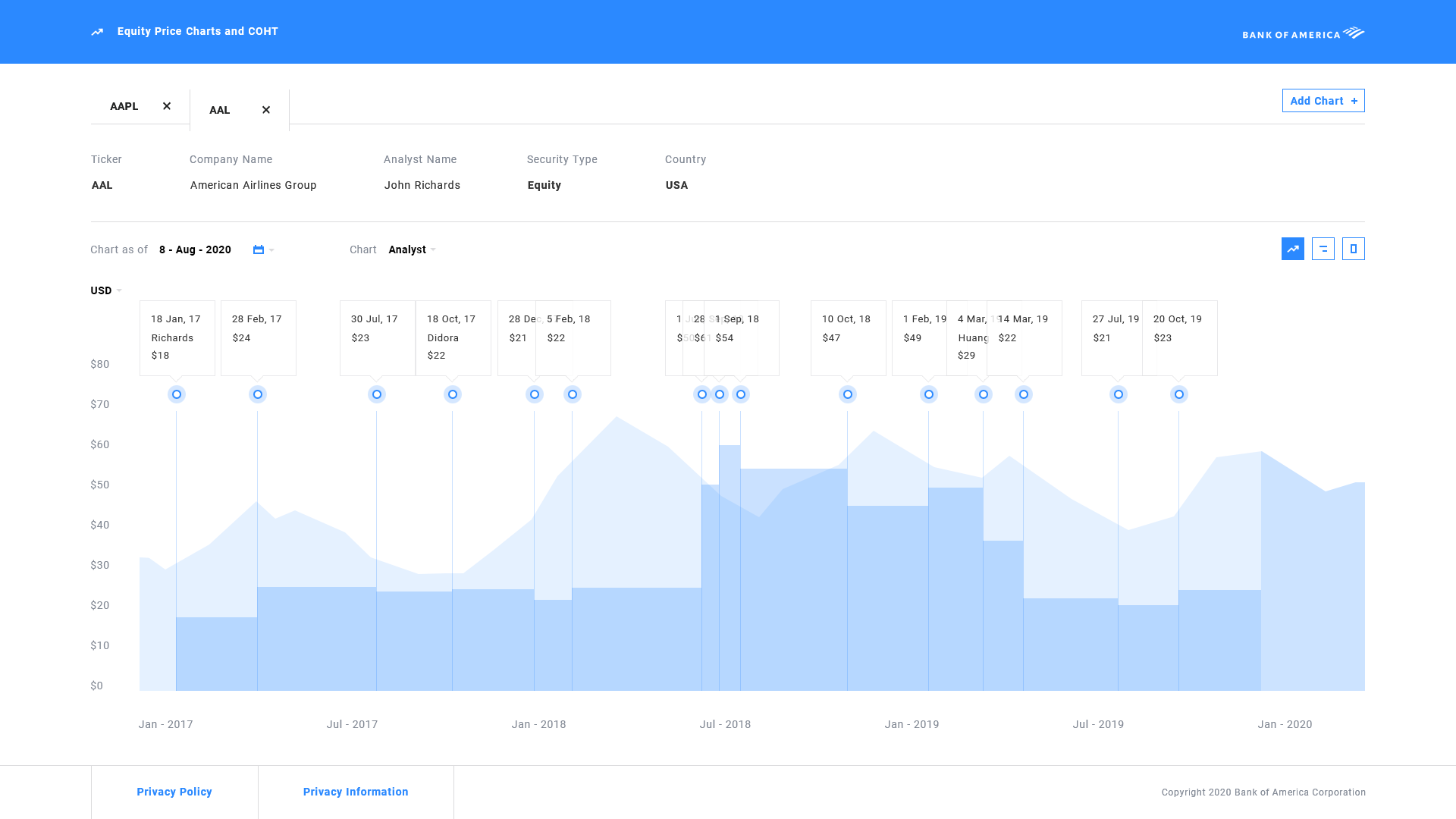
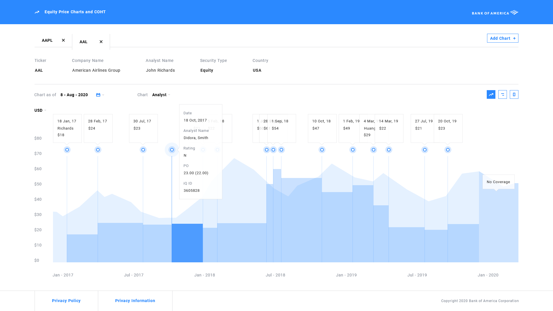
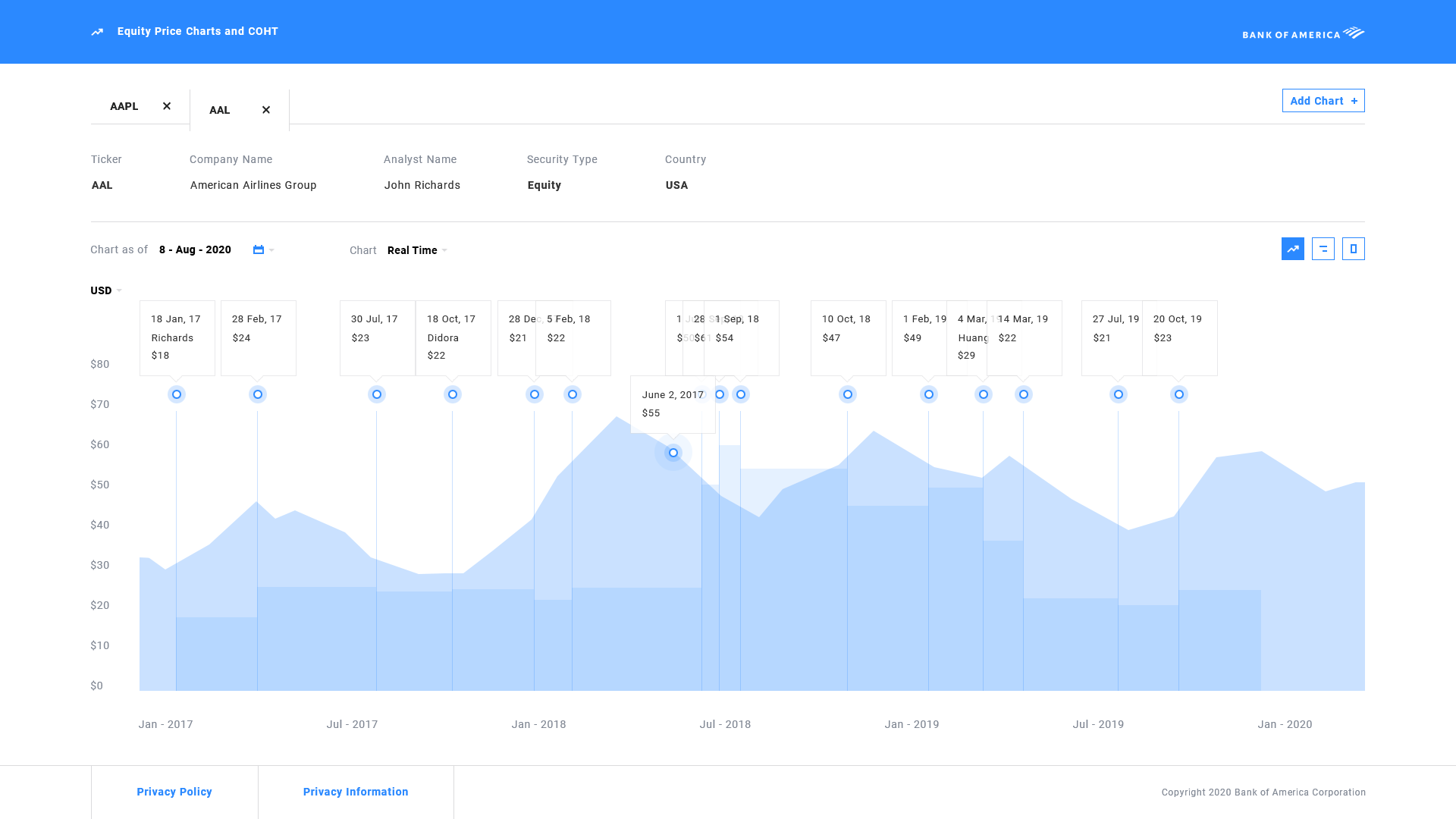
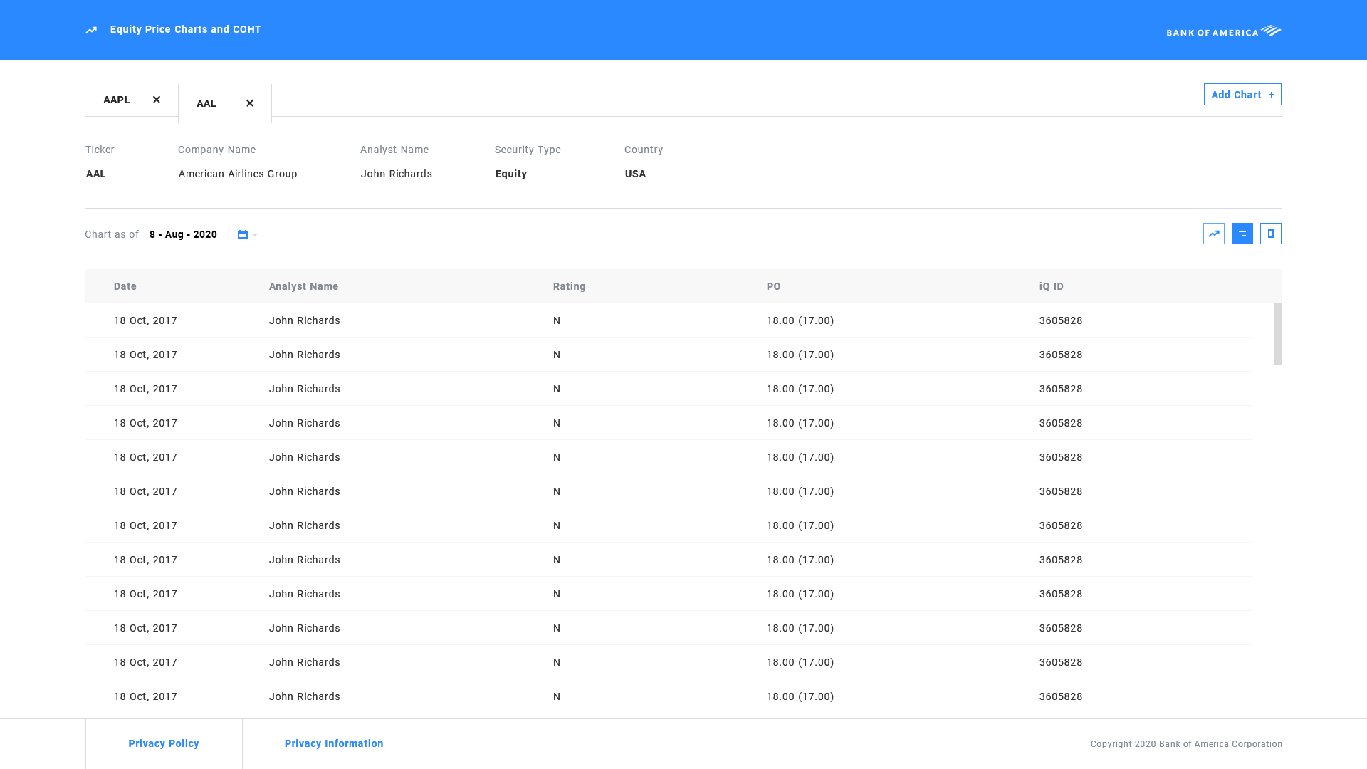
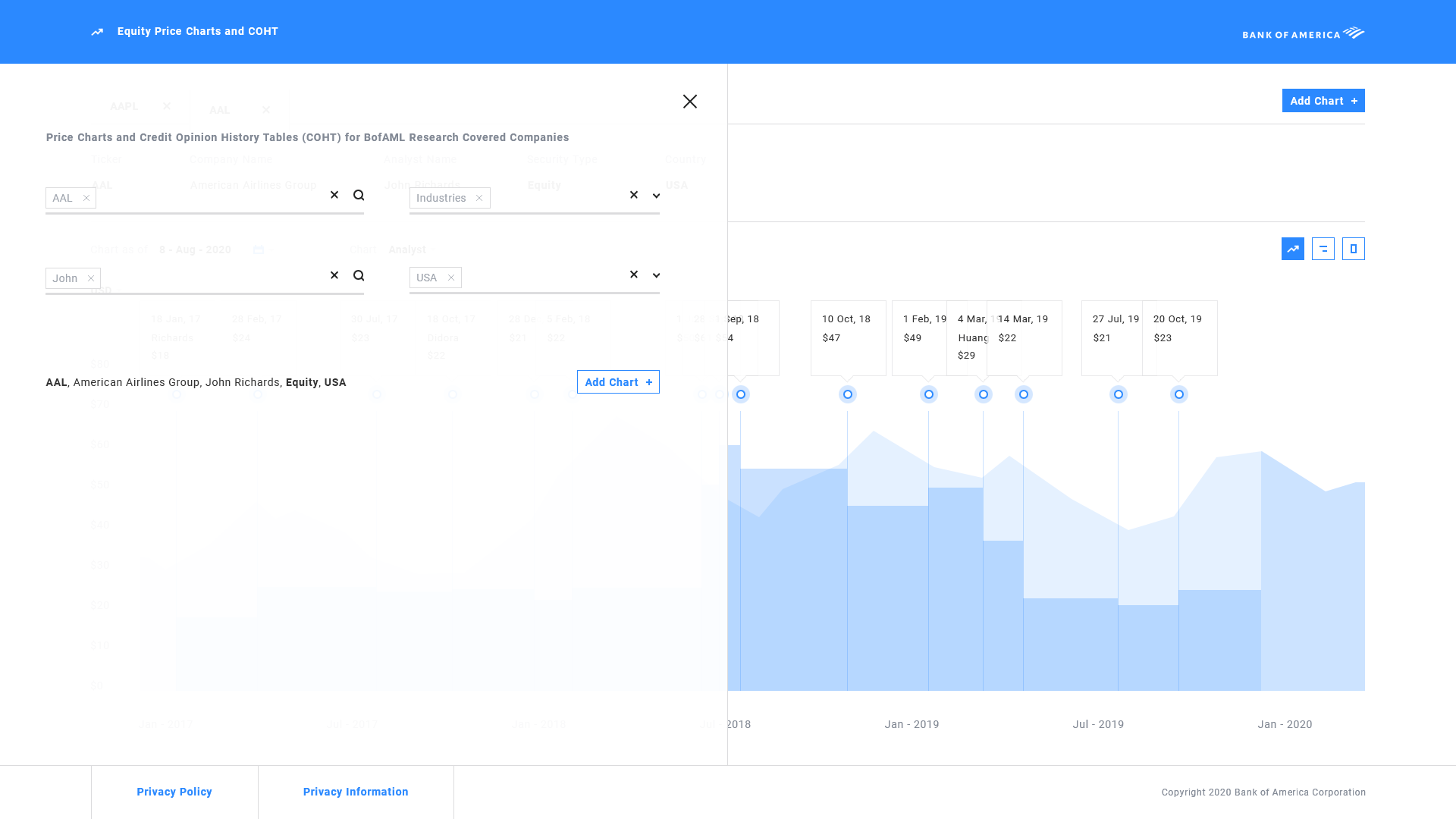
Price Charts (external)
Background
  • To give a little background, all financial institutes are required by law to disclose analyst stock price projections to the goverment. If this compliance requirement is not met, institutes are revoked from conducting business.
Step 1 - Stakeholder requirements
  • We kicked off the meeting with the stakeholders and PMs to get the requirements for the project. This external in particular would disclose the info to the legal system directly after all the info have been vetted by the internal system. Before this was a manual process which was grueling and time consuming for both parties. Our requirement was to automate this process.
Step 2 - User Research and data
  • After gathering all the requirements we got right into research. We did not see other products like this on the market. So we had to build our own exclusively based on the users we were defining who happened to be legal folks specifically performing compliance tasks for the government.
Step 3 - UX and Wireframing
  • Now that we have all the data we need, time to create the experience for the UI. We can start to define the UI and its features based on the data we have gathered.
Step 4 - UI Design
  • Now that we have the basis of the wireframing done, we can use them to shape the UI and its features.
Brand Guideline
  • We used the internal brand guideline and used its modules to create the UI
UI screenflow
  • Upon realizing the sheer amount of tasks the user would be performing while keeping errors to a minimum, I needed to make sure the UI would contain 2 characteristics, simplicity and unification. I have decided to make the UI into a single page experience. This would allow the users to perform all tasks without navigating away from the screen since they have access to all the data accessible to them. This also helps minimizing errors since they longer have to navigate away from the screen, they can keep track of their task progression.
UI screen - Coverage List (main)
  • This is the landing where users select list of coverages (tickers) to check details for.
UI screen - Filter
  • With tens to hundreds of thousands of coverages to select, we've equipped the filter with a robust filtering system. Users can filter for each category and they stack to show the exact results they're looking for from hundreds of thousands of items.
  • By adding a chip for each search, we can add multiple searches so the search is quick, easy and thorough. This is crucial for checking and vetting quickly.
UI screen - Chart
  • This is the meat of the application. After selecting the coverage item from the main page, they're propted to the details page of the selection. Upon selecting, a tab is created for the user which allows them to keep track of the coverage data they've already checked.
  • On the chart all the event logs are plotted for easy tracking. This allows users to not only keep track of data but also minimizes errors when checking for compliance data.
  • Controls are available for the users like calender to check between any time range.
  • When checking the events, if the user wants more details, hovering on any of the event point would display more details about the event allowing them to view all the data about the event. This helps tremendously as the user don't have to navigate away from the chart to see all the details allowing for a unified experience.
  • In addition to the event plots, the chart allows to compare analyst plots to the real time price chart. This allows the user to have all the data they need to check for compliance without manually looking at data tables.
  • Due to hover function, users can now check reasoning behind the missing events if an event is missing. This before was done manually where if there were any missing events, legal would loop back with the bank stopping all operations until the missing data was resolved. Allowing users to automate this process not only saves time but allows the process to occur much smoother.
  • Upon hovering the real-time chart, user can check the price on the real time chart and compare. This reduces the checking process significantly while keeping errors to a minimum making it a much smoother process.
UI screen - table toggle
  • Even though all the data is provided on the chart, if the user just wants access to the table they have the option to view them along with exporting the data to excel if they choose.
UI screen - Coverage select overlay
  • Because this is a single page application, the user will no longer have to navigate away from the screen to select a new item from the main page. The selection would display as an overlay so the user can add a new item to view chart for allowing for easier access. This helps the user to keep track of everything and make the experience unified and simple.
UI Template and Dev Handoff
  • I've created the front end layout to hand off to developers, which allowed them to just render data without having to worry about styling which allowed for faster development process.
Measuring success
  • In order measure if the project was successful, we've recorded an significant decrease in time for our bank to be cleared for compliance. We have also noticed a significant reduction in back and forth looping for clearance by the legal system, hence making this project a huge success. Currently this system is being used by Bank of America for disclosure submission and has won awards for our department.
Note: All examples displayed do NOT contain any sensitive data. If during any process any sensitive data was used, it has been omitted from displaying.