Bank of America
Bank of America disclosure team is a department that discloses critical and useful information for other analysts to use. With my full time in the company I worked on various projects from complex and data rich dashboard system to web and mobile applications. One of the main projects I was tasked with was called the "Price Charts". It has 2 versions, internal (dashboard) and external (public site). I was to bring both versions from concept to development ready phase. I've also led the front-end dev team to allow for a smooth development phase while ensuring all the proper design styles and layout development requirements were met. We've worked in an agile environment with a Project manager ensuring everyone was on track and up to date with the scheduled releases.
Role:UI/UX, Product Designer, Branding
Tasks:UI/UX, Product Design, Branding, Visual Design
Price Charts (Internal)
Approach
- The Price Charts (internal) will be an extension to existing disclosures dashboard, with its own unique functions.
- Since this is a standalone project with its own unique functions, it'll have its own unique separate section and tab.
The UX
- Define concept and challenges.
- Define target audience.
- Define user journies.
- Develop sitemap.
- Design product UI and visual.
- UI Kit for Developers.
concept
- The Price Charts is a platform in which massive amount of data is stored of price analysis by analysts of different stocks and tickers.
- This data will be used by other analysts for their own analysis as well keeping track of the updated info of the tickers.
- Because this platform will also be used for data tracking purposes to keep info up to date, there needs to be a feature that depicts any missing info or other issues associated with a specific ticker.
challenges
- Based on the concept document I was provided, I made an early concept of the UI showcasing how the data will be displayed onto the UI. This however was rejected due to the massive amounts of data being organized in a certain way in the backend, that it wasn't able to accomodate my early UI concept.
- Now this increased the challenge multiple fold as I needed to find a way to not only design the UI that would support how the data is organized in the backend but also work within this constraint to provide the best possible user experience.
- Another challenge I was faced with was how to deal with this data display constraint. Now I needed to build a UI that also needs to not make it obvious to the user of this constraint of displaying the data.
Target Audience
- The target audience has been established since the beginning and it has been made clear who we're building this project for. They're analysts of Bank of America that uses plethora of data for their daily tasks and this project would provide another tool for them to use.
User Journey
- In order to tackle some of the challenges we faced I needed to become very familiar with how the data is organized in the backend.
- Since this project is prioritized as being "data-centric" first and "user-centric" second, I needed to find someone who has a deep understanding of how the data is organized in the backend system.
- I found the right person who has been with the company for over 10 years and has a really deep understanding of where all the necessary data sits for this project. He has played a pivotal role throughout the UX process of understanding what data to use, where it sits and how to build the UI based around this data structure.
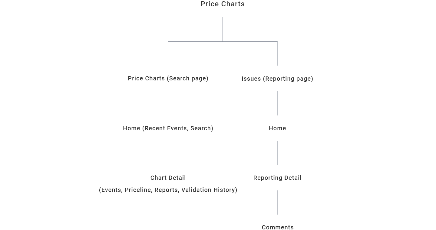
Sitemap
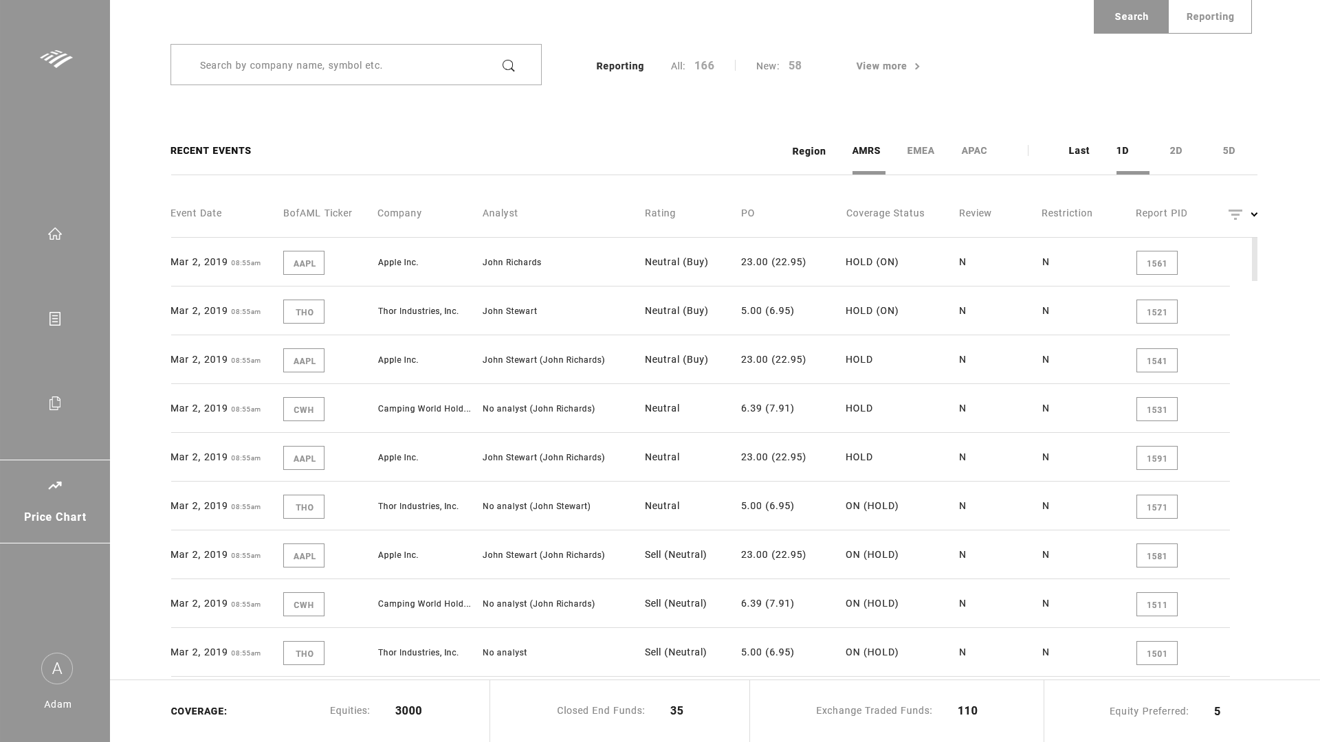
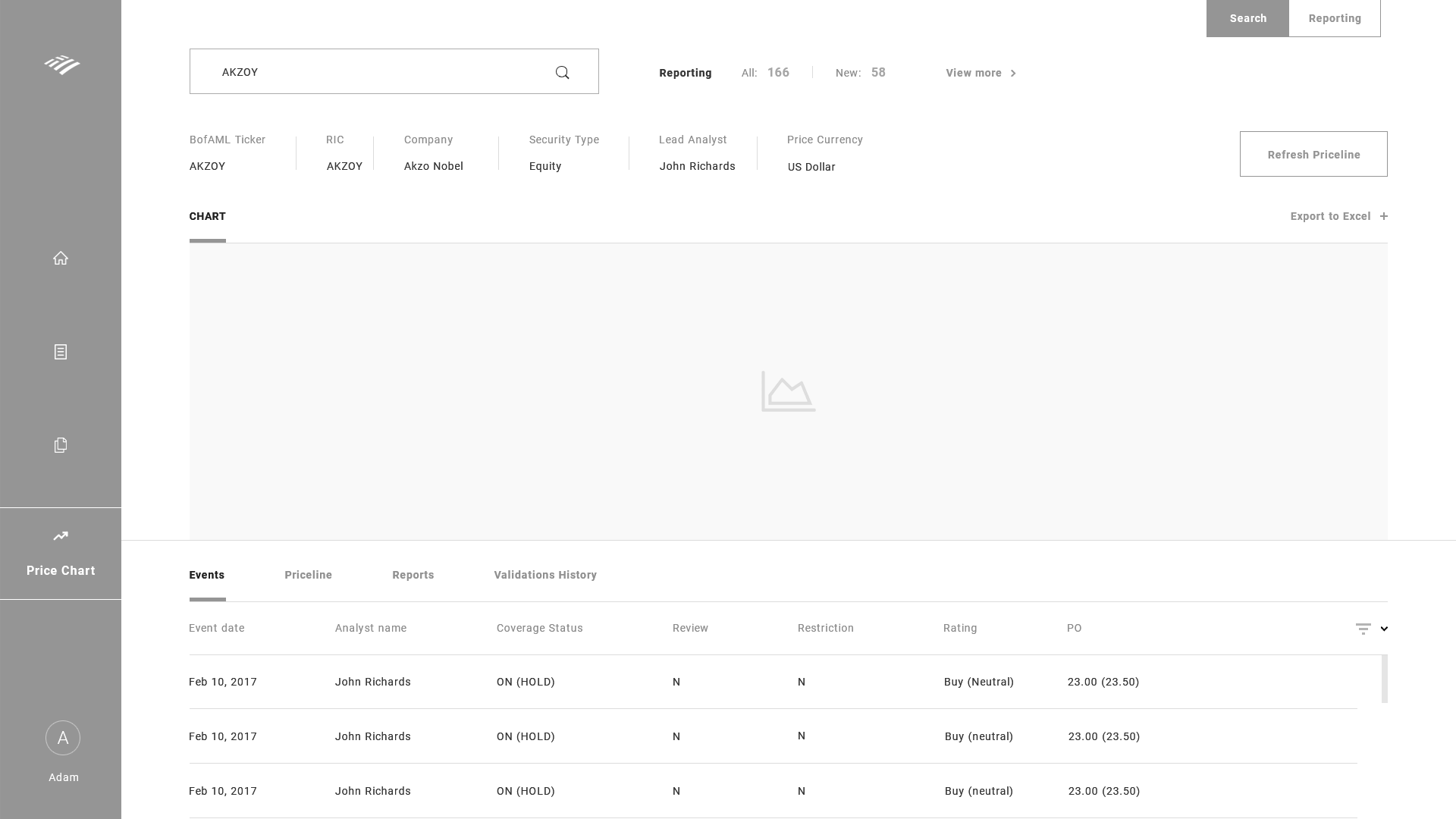
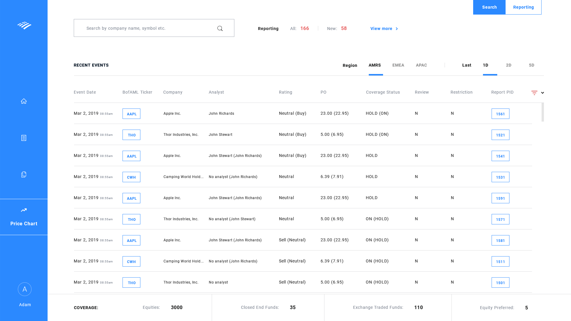
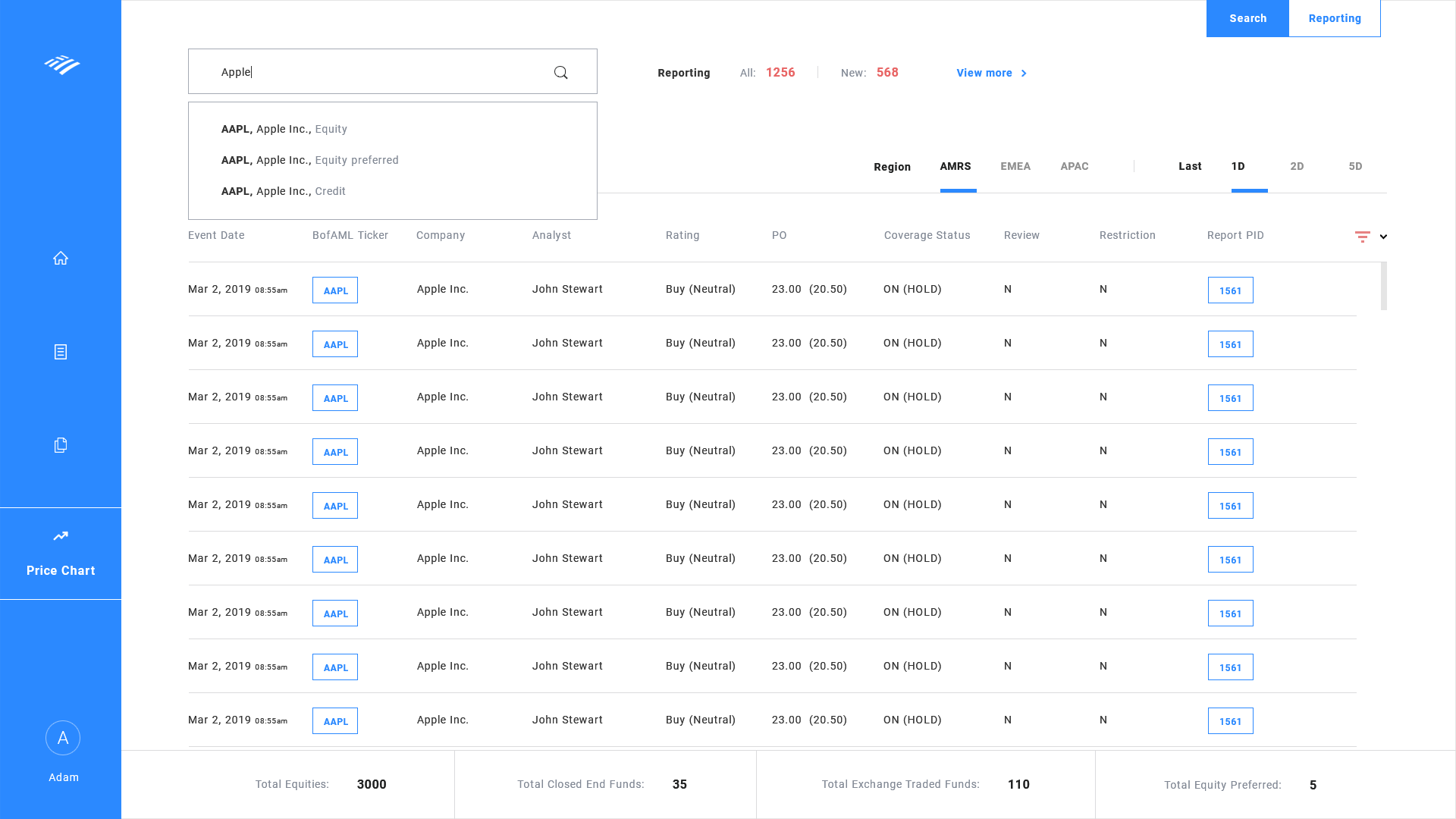
- Now that I have a deep understanding of the data structure, I started building out the sitemap. Based on the concept and the data structure we see we have 2 major functions; Price chart data and issues related to ticker which can be labeled as "Search" and "Reporting" respectively. Where "Search" represents searching for a specific ticker to view its data and "Reporting" represents listing of issues based on issue types. Both were given its own page respectively from the main menu.
- Becuase of the amount of data that needs to be displayed on the UI, we needed to make the UI as simple as possible so the analysts can find the data they're looking for very easily.
- Initially I wanted to just have the dashboard limited to 2 pages to keep it simple. This however was difficult to implement as the sheer amount of data being limited to 2 pages would cause serious loading delays.
- With much iterations I've limited it down to 4 pages. This struck a sweet balance of load time as well as keeping the UI simple. I've kept it so that the main pages (Search and Reporting) have a home and a detail page respectively.
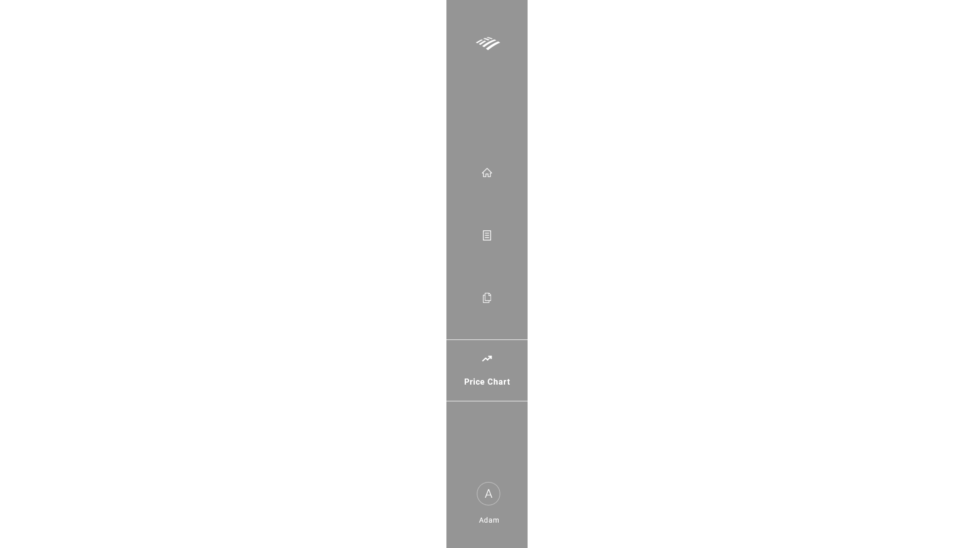
UI wireframe - Sidenav
- The current dashboard has sidenav as a primary navigation. We'll keep this intact as we don't want to stray too far from what the analysts are used to.
- The sidenav needs to have an old familiar format with a new modern aesthetic.
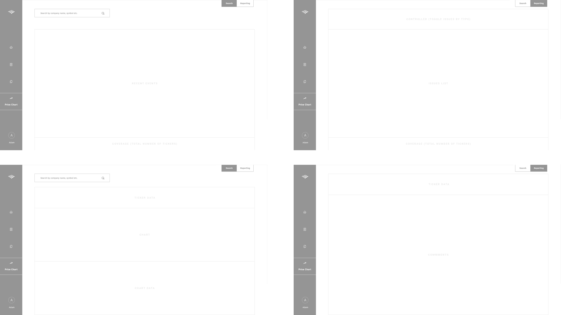
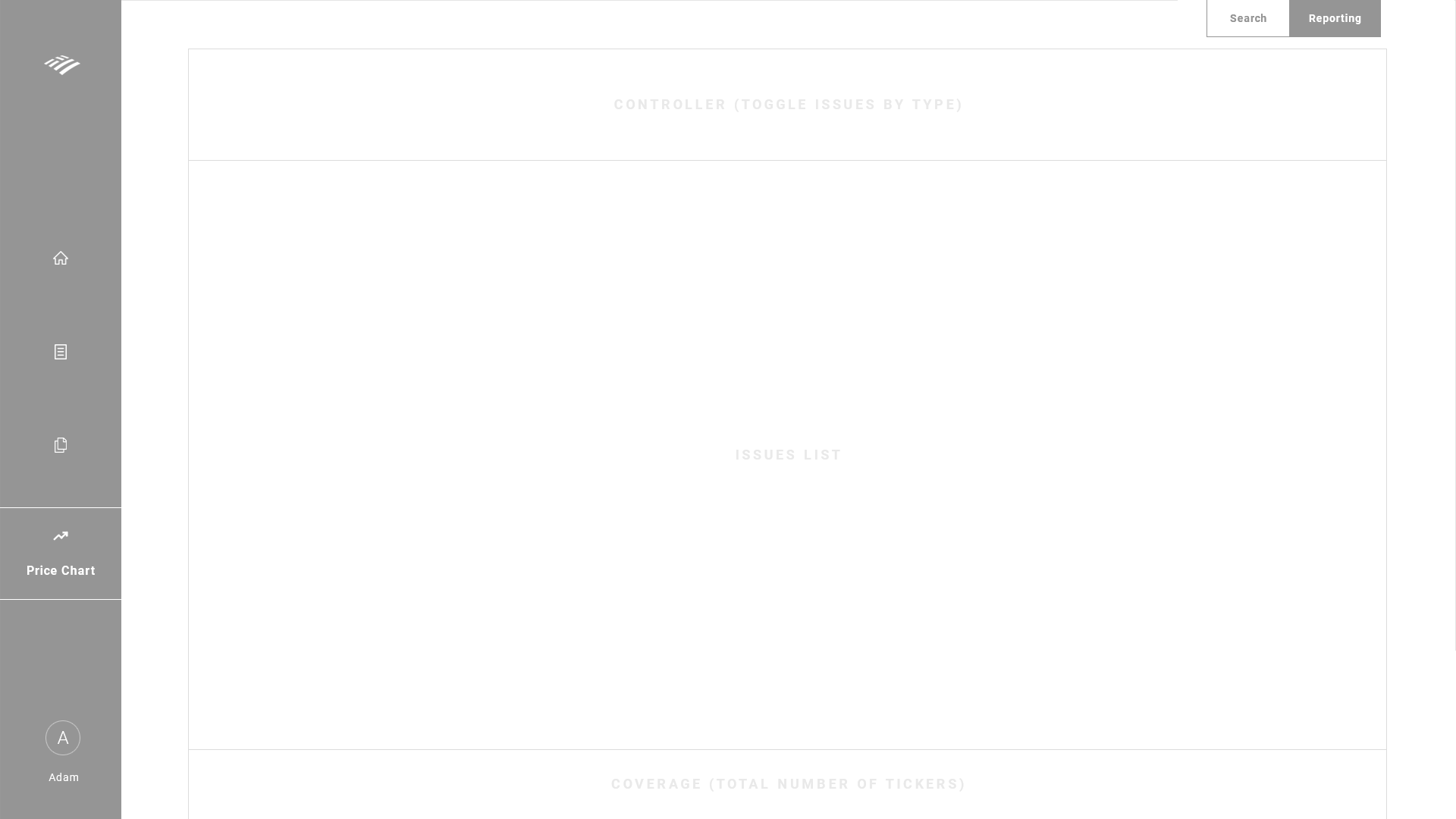
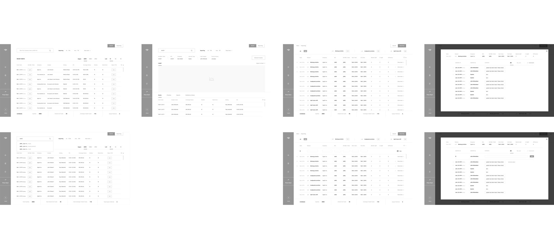
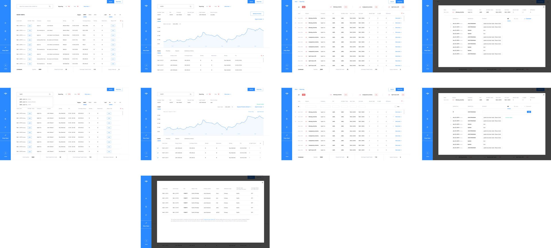
UI wireframe - Main pages [basic outline]
- I have outlined the 4 main pages outlining where the data will be placed.
- Any additional features or data will open up to a modal which serve as the end point phase of a navigation, meaning there will be no pages beyond the modal. This also helps letting the user know they're at the end phase when opening a modal.

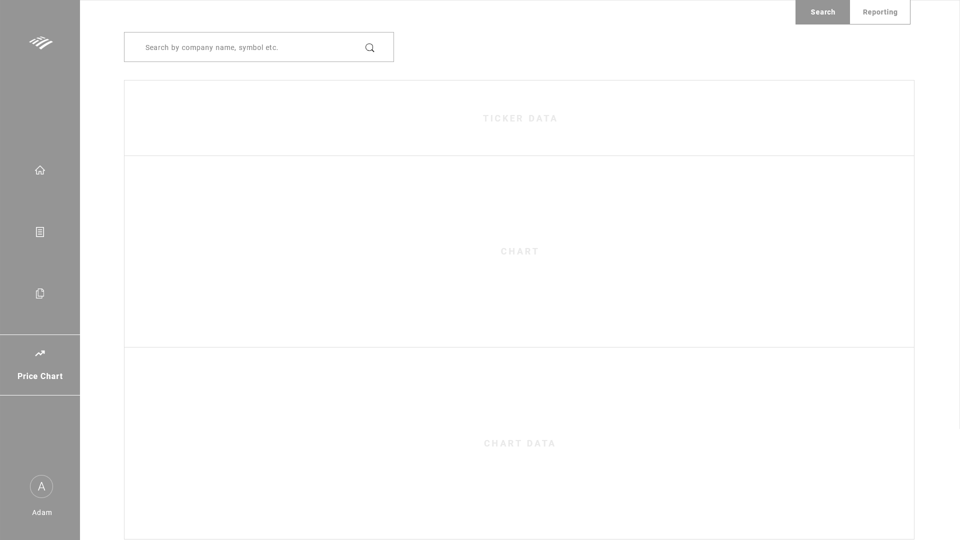

UI wireframe - Main pages
UI wireframe - Flowchart
UI wireframe - Search dropdown

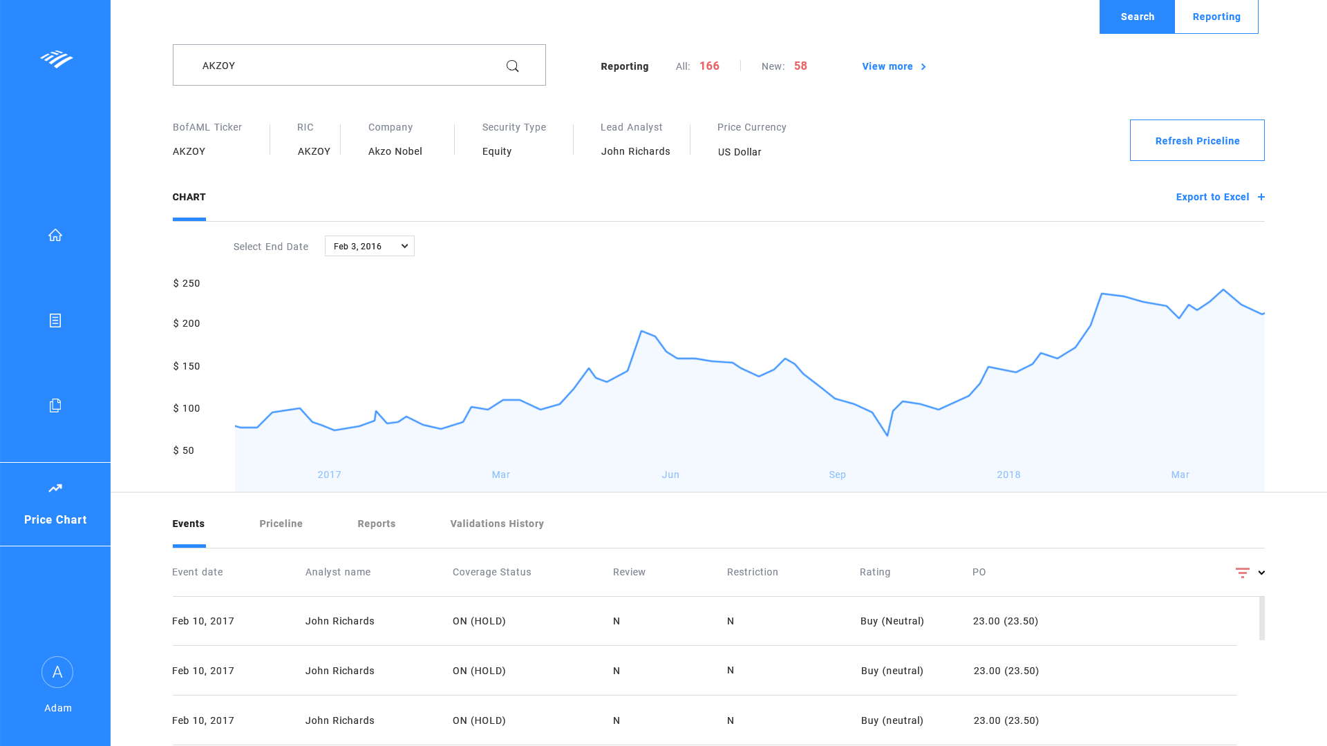
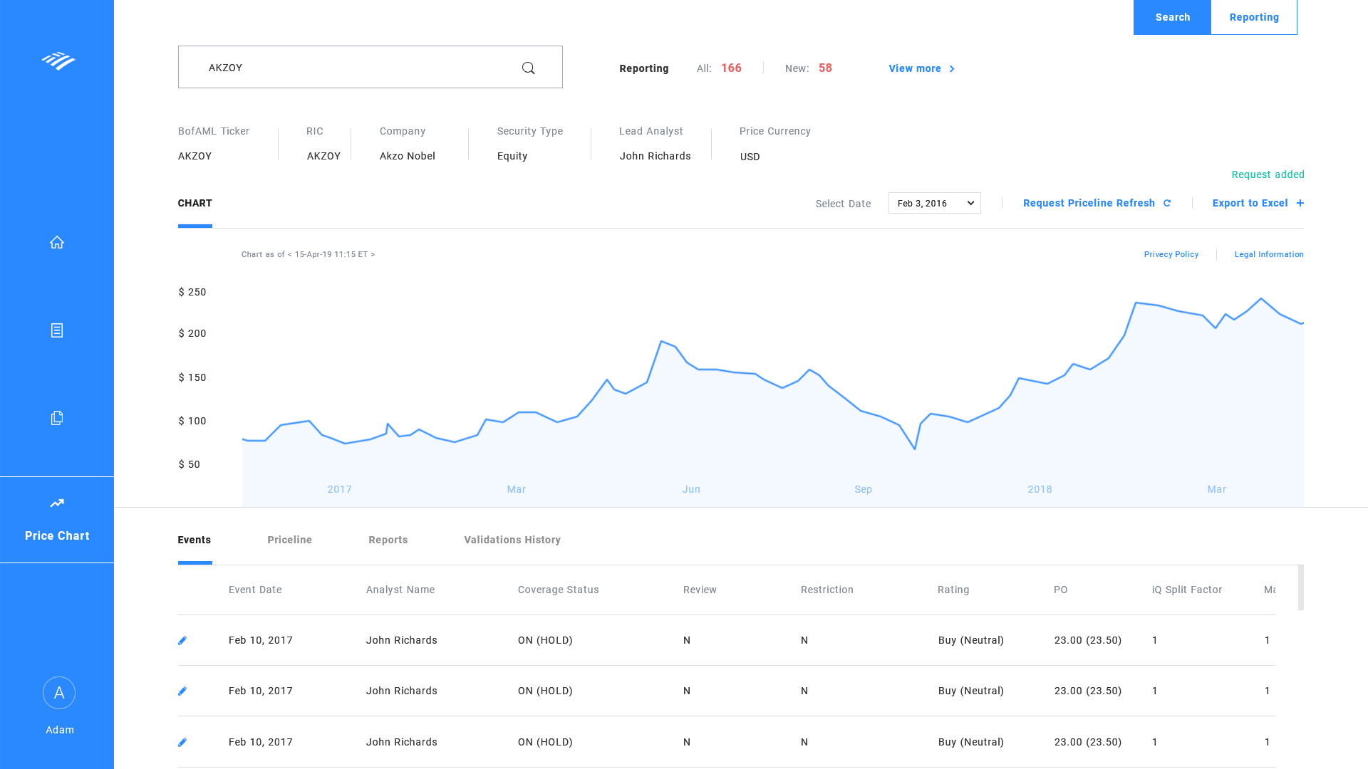
UI wireframe - chartdetail page - request priceline
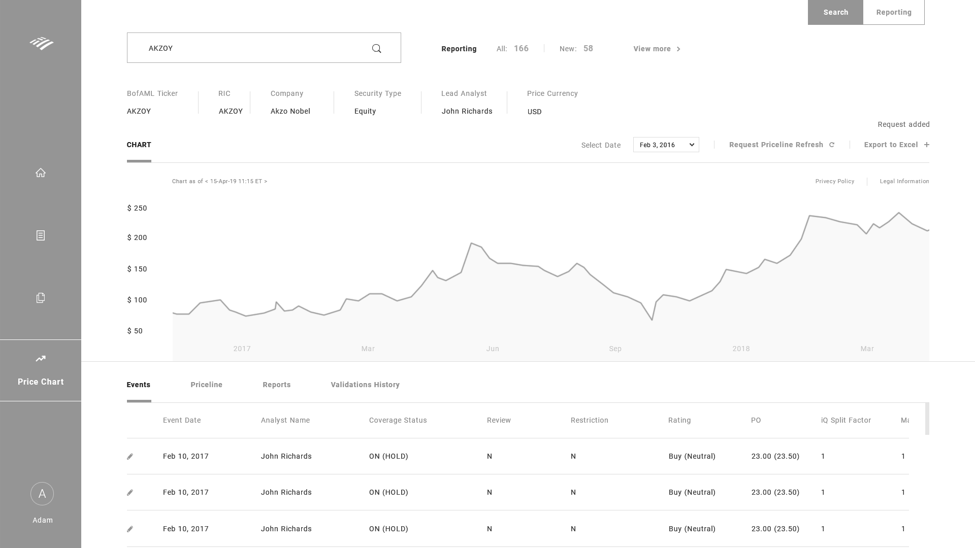
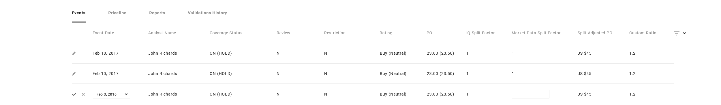
UI wireframe - chartdetail page - Events
- The "Market Split Factor" data can be edited straight on the dashboard by clicking the edit icon.
- Editing the data would update the rest of the data accordingly as well as update the backend.
UI wireframe - chartdetail page - Priceline

UI wireframe - chartdetail page - Validations History

UI wireframe - chartdetail page - Reports

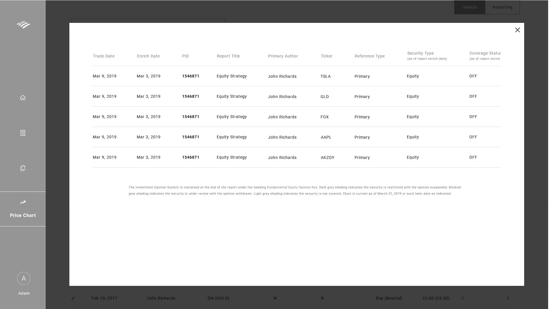
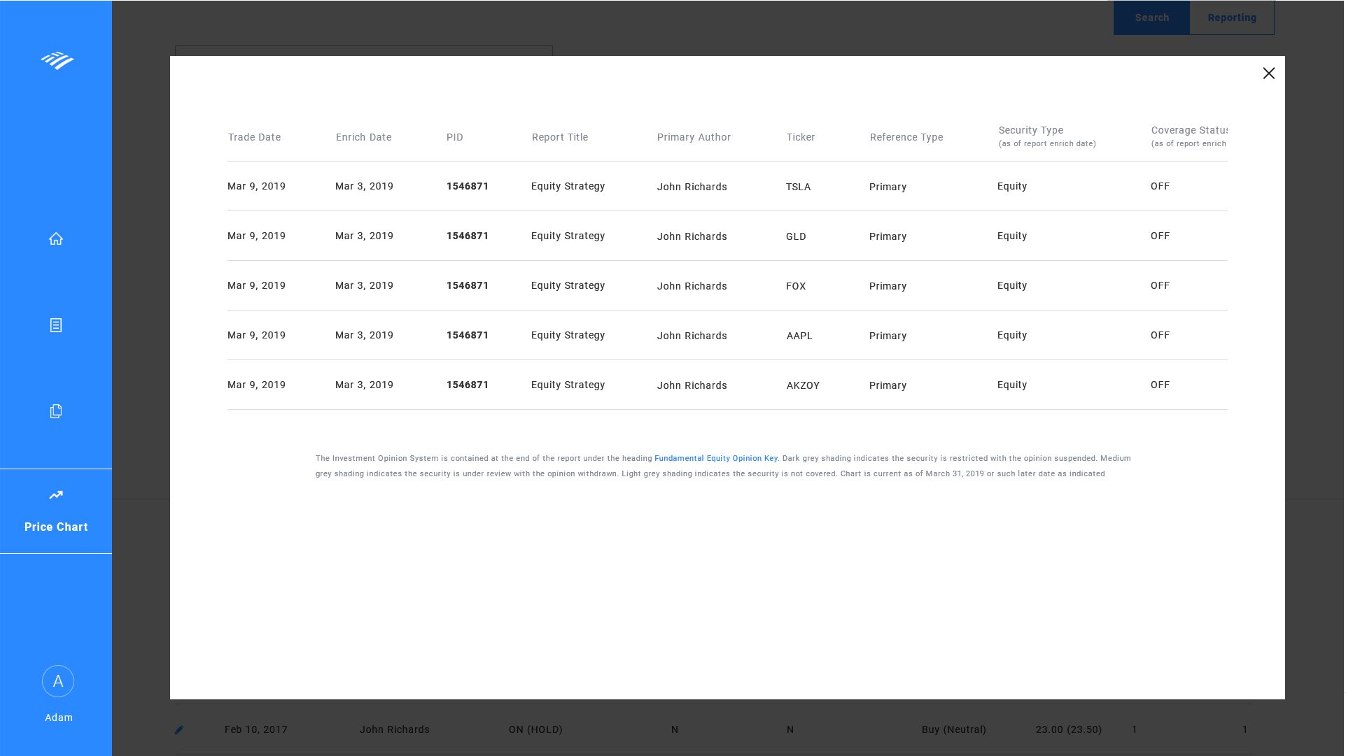
UI wireframe - chartdetail page - PID
- Upon clicking the PID button, it'll open up to a modal that'll give more info about that specific PID.
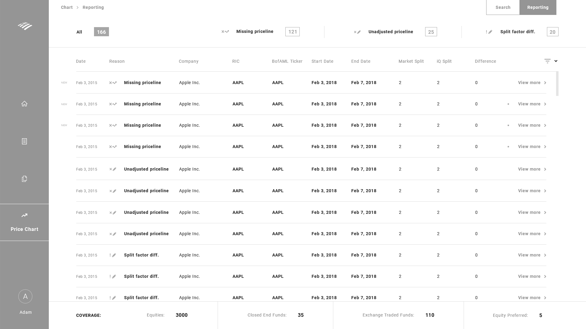
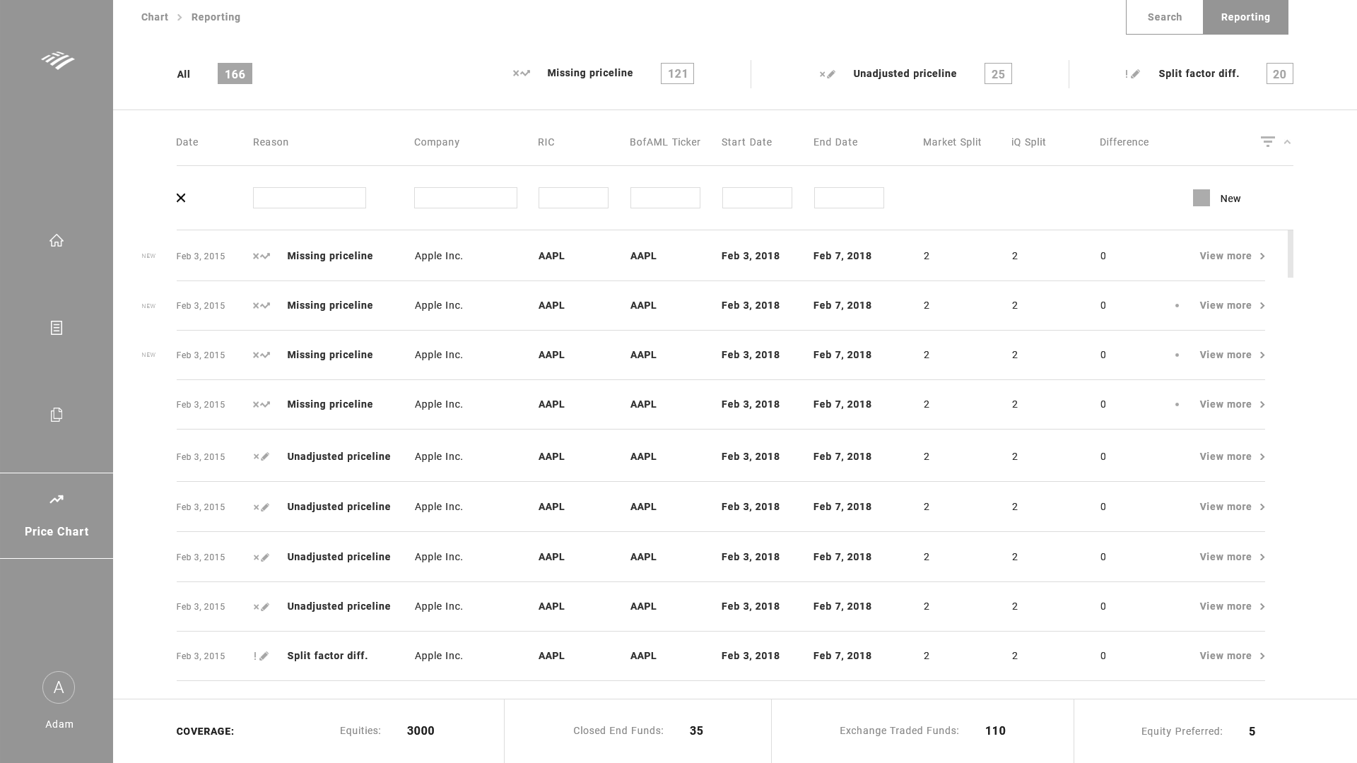
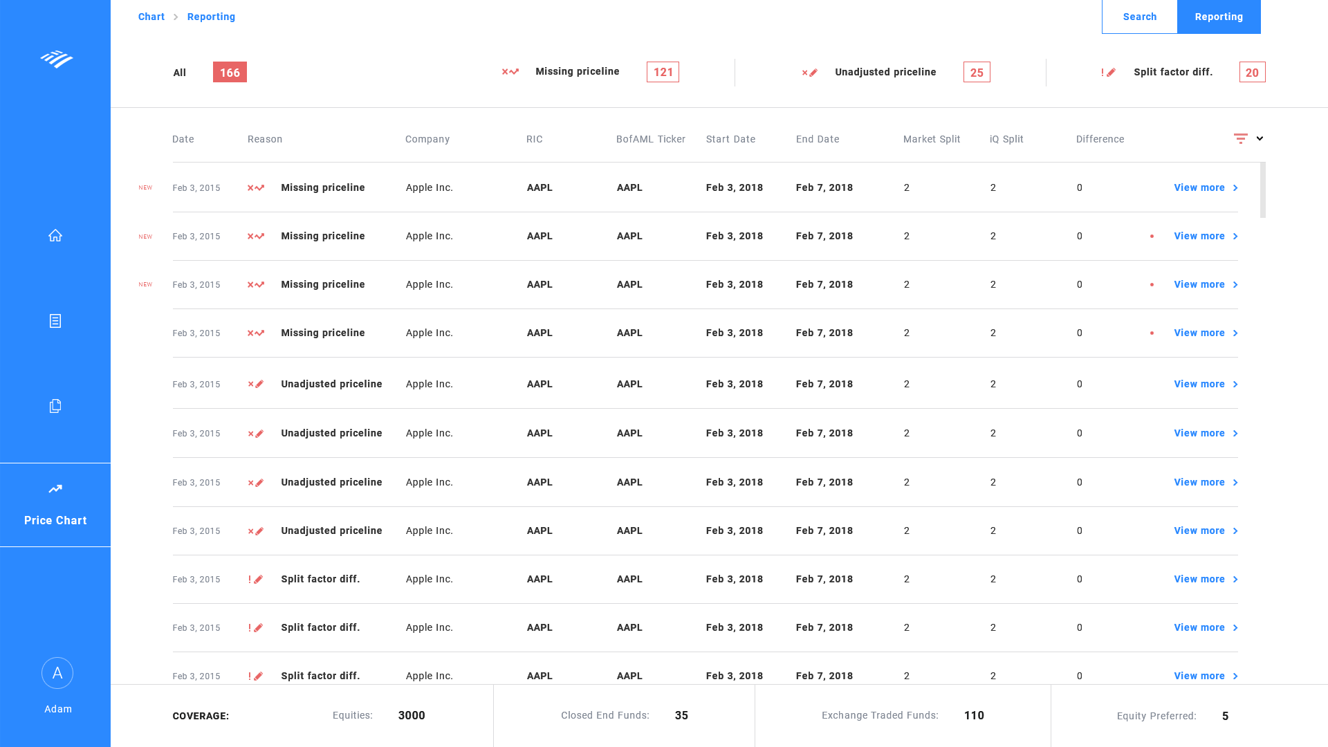
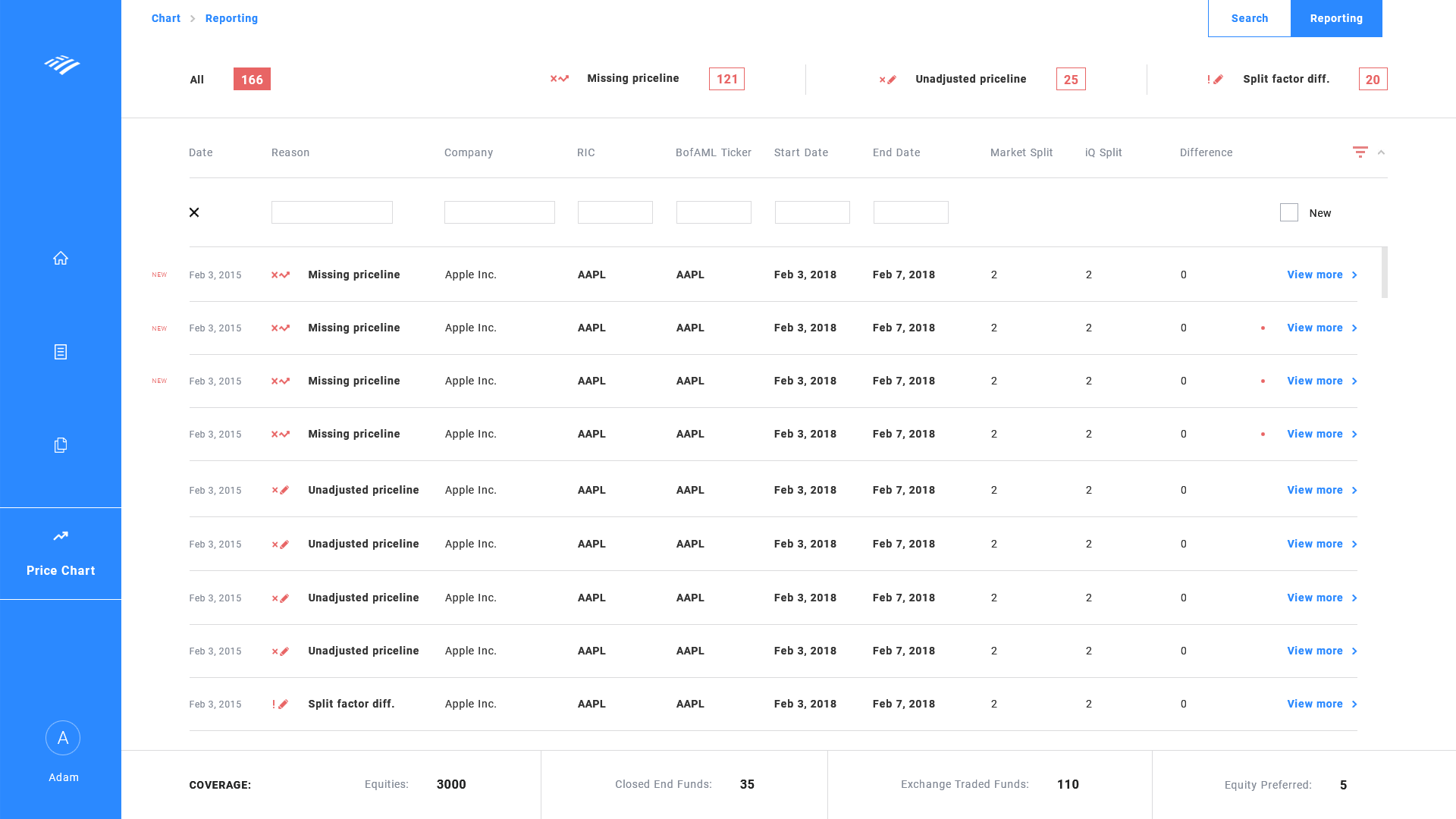
UI wireframe - reportingdetail page - universal filter
- The universal filter adds a filter to each data column in the dataset.
- This can be combined with each other to narrow down the results from thousands of data.
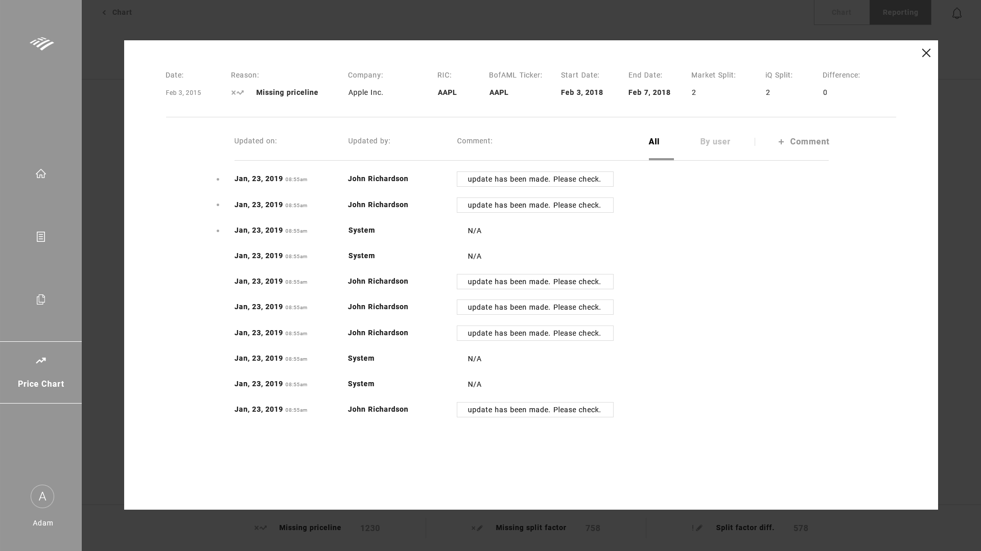
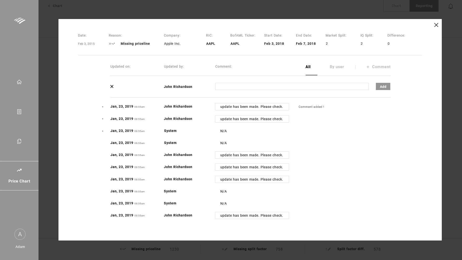
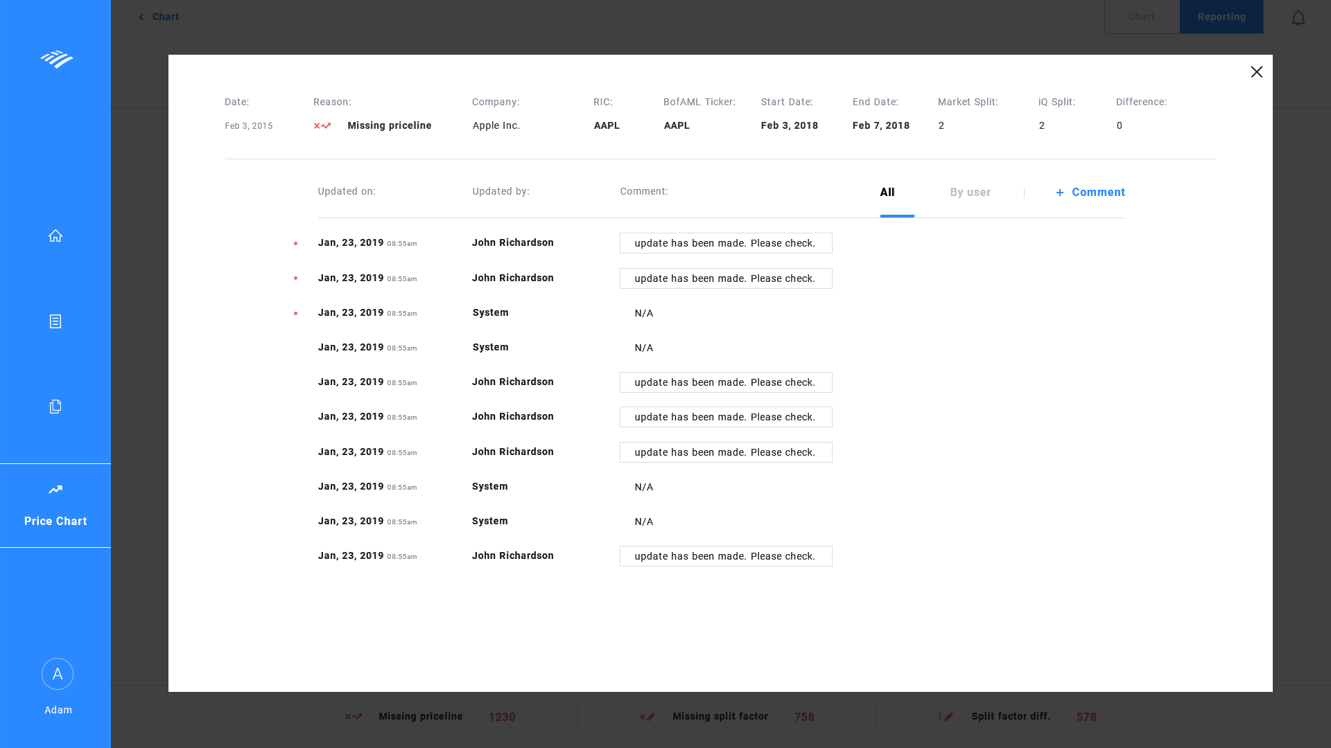
UI wireframe - comments page
- Since the comments page is the final point of the Reporting page, it'll open up to a modal.
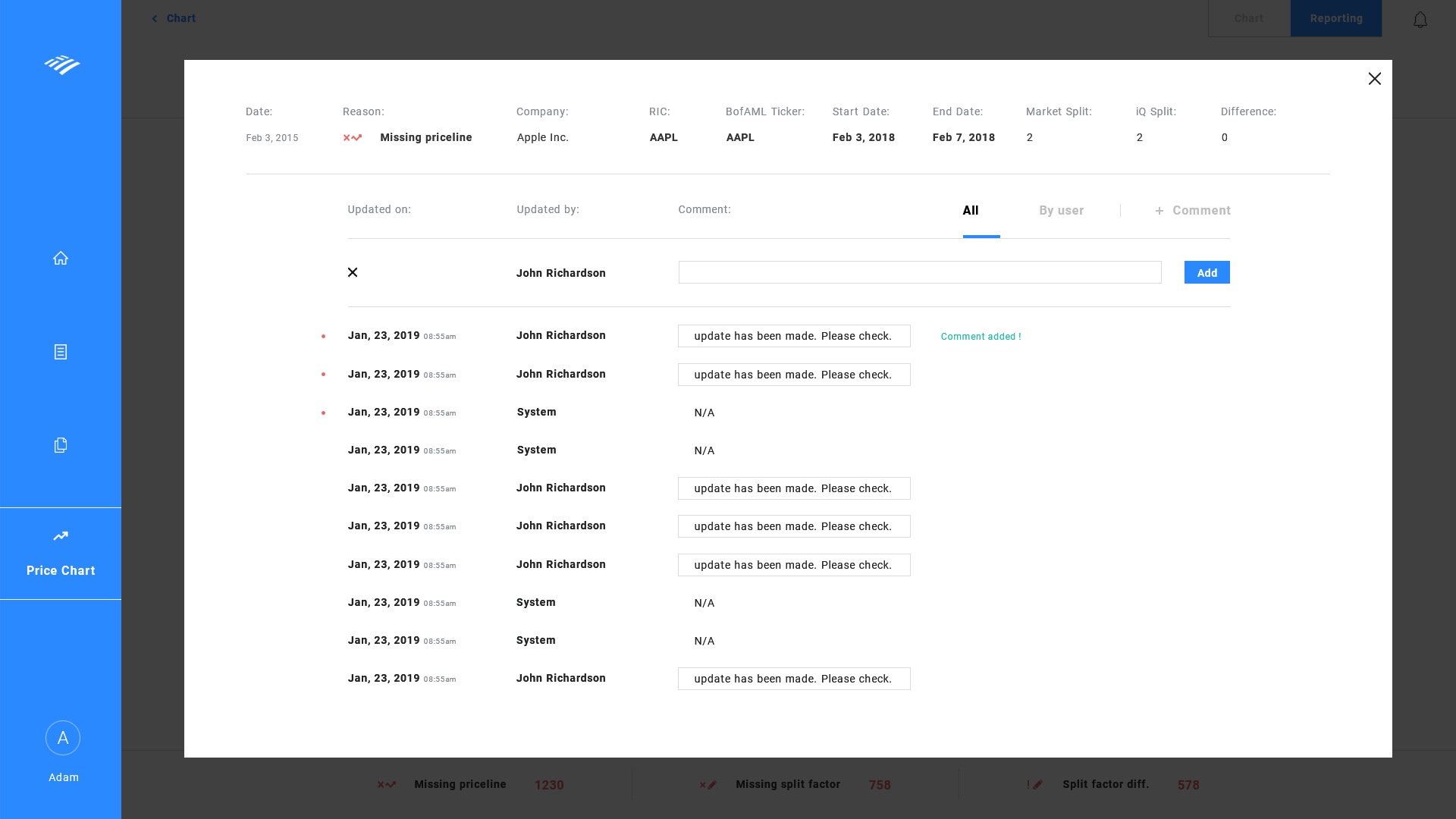
UI wireframe - comments page - add comment
- Comments can be added by clicking "+ Comment" button which will automatically add comment on the top of the list upon entering and selecting "add".
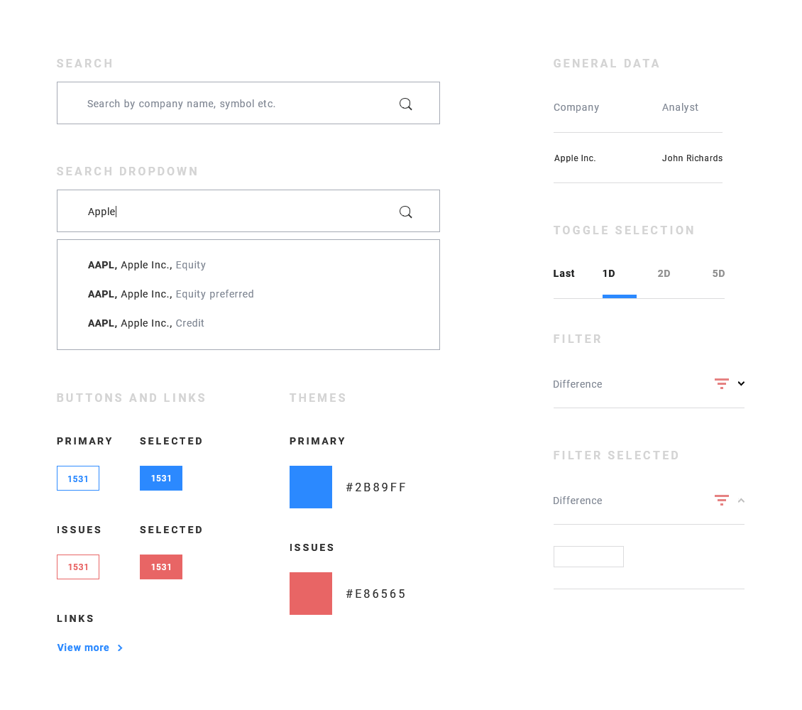
UI visual
UI Kit and Dev Handoff
- I have designed the UI kit to hand off to the developers and uploaded the designs to Zeplin for derivation of specs.
 Note: All examples displayed do NOT contain any sensitive data. If during any process any sensitive data was used, it has been omitted from displaying.